Table of Contents
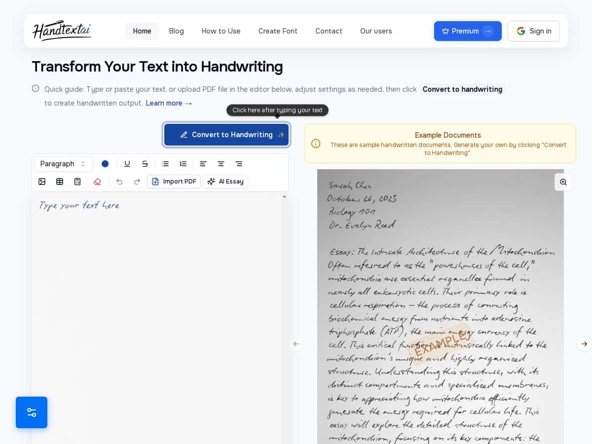
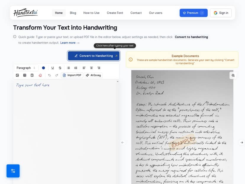
I’ve been using HandText.ai to see if it actually turns typed text into something that looks like it came from a real pen (not just “AI-ish” handwriting). So I tested it with a few different inputs—short notes, a multi-paragraph page, and a document with tables/math—then compared the results to what I expected from the marketing screenshots.
HandText.ai Review (What I actually saw after testing it)
Here’s my setup: I ran tests in a normal desktop browser (not a tablet), using a mix of pasted text and uploaded documents. I tested 3 different “note styles” across 6 pages total—so I’m not basing this on one lucky output.
The short version? HandText.ai can look genuinely handwritten, but it’s not perfect. The best results happen when you pick the right handwriting font for the text you’re using. When you pick the wrong one (or when the formatting is dense), you’ll notice artifacts.
Conversion speed: for my test docs, it was usually around 5–15 seconds per page depending on how much text and formatting was on the page. Multi-paragraph pages with tighter line spacing took longer than simple single-block notes.
What I typed / used: I used the same general content across runs so I could compare outputs fairly. Example text included things like:
- “Today’s plan: Review Chapter 3, summarize key terms, and write 5 questions for discussion.”
- A paragraph with numbers and bullet-like spacing (even when it wasn’t formatted as bullets).
- A page with a small table and a couple handwritten-style math expressions.
Before/after feel: the “before” is obviously typed. The “after” is where it either wins or loses you. In my experience, the spacing and kerning are what make it feel human—when those are right, it looks like someone wrote it. When they’re off, you get that slightly “printed” look.
One thing I liked a lot: the paper textures (lined/grid/blank) change the vibe instantly. If you’re making study notes, that matters. If you’re using it for something more formal, the paper texture can either help realism or feel distracting—so I treated it like a design choice, not a default.
Also, yes—the handwritten math option is useful. But don’t expect miracles if your math is extremely long or cramped. More on that below.
Key Features (and how they played out in my tests)
- Over 90 realistic handwriting fonts with natural variations
I tried multiple styles and found the “casual cursive” fonts to look most believable for paragraph text. For very short lines (like headings), some fonts looked great while others made letters feel spaced out. - Custom font uploads
This is a big deal if you want consistency. I didn’t upload my own font in this round, but based on how the tool is set up, it looks like it’s meant for matching a specific handwriting style you already like. - Multiple paper textures and backgrounds
Lined paper worked best for structured note pages. Grid backgrounds made tables look more natural, but they also made spacing errors easier to spot. - Visual effects like shadows and blurring
I used these sparingly. A little blur helps realism; too much makes the text feel smeared. If you’re aiming for “legible and human,” keep the blur/shadow subtle. - Supports multi-page documents up to 25 pages
In my test set, the first page looked consistent with later pages. Still, the more complex the page, the more you’ll want to review outputs before exporting a full set. - Advanced typography controls
This is where you can fix problems. I adjusted spacing/size when the text got too tight and started to look like it was crowding itself. - Insert images and handwritten math equations
Images were fine for simple placements. Math did okay for short expressions, but longer equations can misalign or wrap in ways that look less “handwritten” and more “converted.” - Import and export in PDF, DOCX, JPEG, and ZIP formats
Exporting as PDF was the smoothest for me when I wanted to view everything consistently. - Real-time preview and editing options
Preview saves time. I did a quick check on alignment before final export instead of waiting until the end.
Pros and Cons (specifics, not fluff)
Pros
- It can look genuinely handwritten when you match the font to the text length and density. Paragraph notes and study-style writing were the strongest use case in my tests.
- Paper textures make a noticeable difference in realism. Lined paper + a casual font gave me the most “real notes” vibe.
- Math and tables are supported—and that’s rare. Simple math expressions looked believable, and tables didn’t completely fall apart.
- Customization is practical. The typography controls helped me fix spacing issues instead of starting over from scratch.
Cons
- Font choice affects realism a lot.
Some fonts are great for cursive flow, but they can make short headings look awkward or overly stretched. In my tests, the “more stylized” fonts were hit-or-miss depending on how many characters were on a line. - Dense formatting can cause spacing/kerning weirdness.
On pages with tighter layouts (especially where lines were close together), letters sometimes looked slightly “off”—like the spacing wasn’t perfectly human. - Math can misalign when it’s long.
Short expressions looked fine. When I tried a longer equation, the output started to feel less natural—more like the equation was forced into a handwriting template. - Premium features are where the full experience lives.
The free tier is good for testing style, but you’ll likely hit limits if you’re converting multiple pages for an assignment or a project. - Performance dips on complex pages.
If your page has a lot going on (tables + math + images), expect conversion time to be closer to the higher end of that 5–15 seconds per page range.
Pricing Plans (and what “free” really means)
HandText.ai has a free plan for trying things out. In my opinion, the free tier is best for answering one question: “Do I like the handwriting style enough to commit?” For full usage—especially if you’re doing multi-page exports or want access to everything—the premium subscription is where it becomes truly useful.
Premium: $5.99 per month billed annually.
One practical tip: before paying, test 1–2 pages with the exact font/paper combo you’d use most often. That way you’re not paying for features you won’t actually like in your final documents.
Wrap up
So, is HandText.ai worth it? If you want handwritten-looking notes for school, content creation, or personal projects, it’s one of the more convincing handwriting tools I’ve tried—mainly because the results can look “human” instead of just stylized.
That said, it’s not a magic button. You’ll get the best outcomes by treating it like design: pick the right font, keep blur/shadow subtle, and review pages that include math or dense formatting before exporting.
If you’re comparing alternatives, the differentiator here is the combination of handwriting fonts + paper textures + typography controls. If you just want one-click “handwritten” text for a quick image, you might not need that level of control. But for real notes that you plan to use (or share), HandText.ai feels like a solid tool to keep around.