The AI Book Creator
That Publishes for You
Generate 150+ pages with images, an AI-designed cover, and one-click publishing to your own marketplace. No exclusivity, no wrangling.
What do you want to create today?
🎙️ Record your thoughts
Have the book done in 2 minutes
Voice to Book
NEWNo credit card required.
Verified onGoogle Play·There's An AI For That·Trustpilot·Google
🎙️ Record your thoughts
Have the book done in 2 minutes
Voice to Book
NEWImagine Your Book Here
These books were created using our AI-powered platform. From cover design to content structure, your original book can stand out with its own voice.

The Mind Reset
🧠Psychology & Mental Health


Click any book to explore • Drag to browse
How much you'd earn publishing with Automateed
This shows potential royalties from book sales. You keep 85% — payment processor fees included.
Book sales scenario
Price × copies × 85% royalty
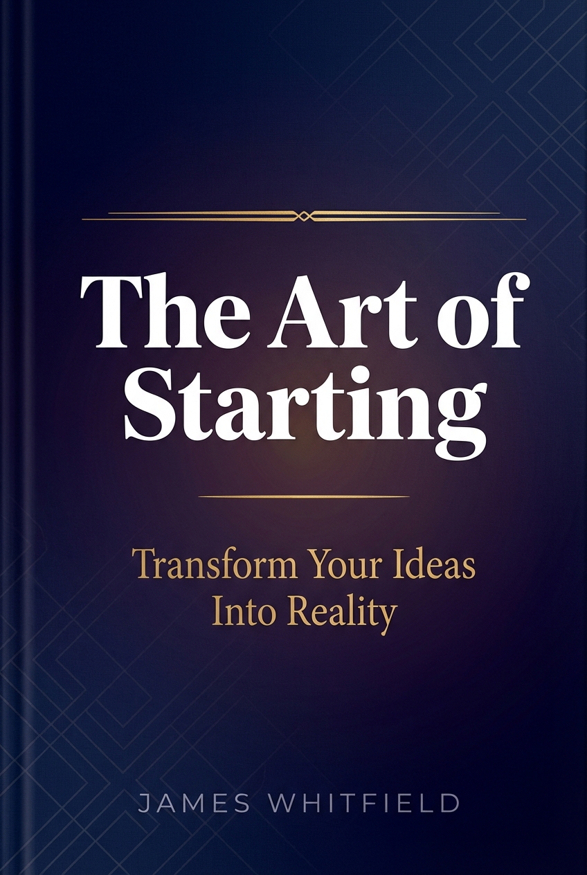
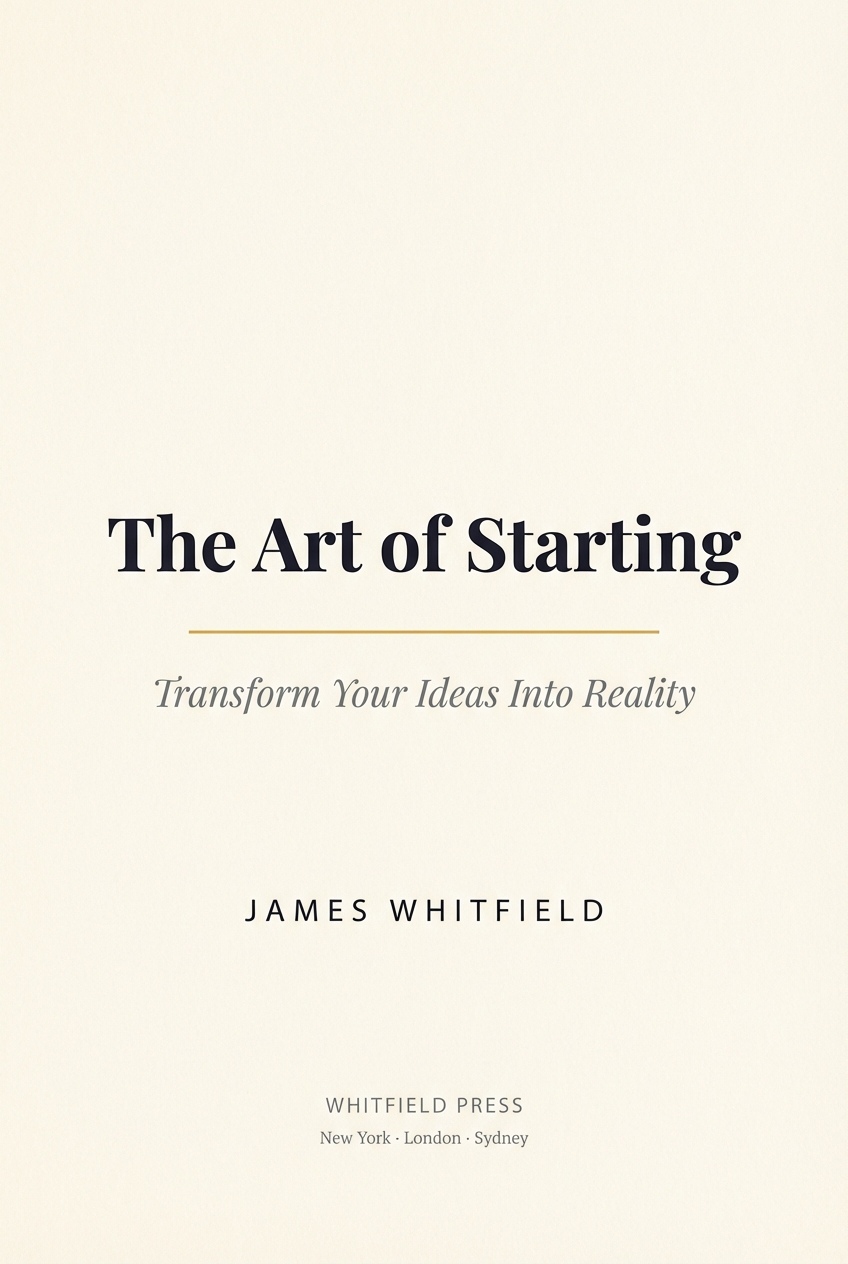
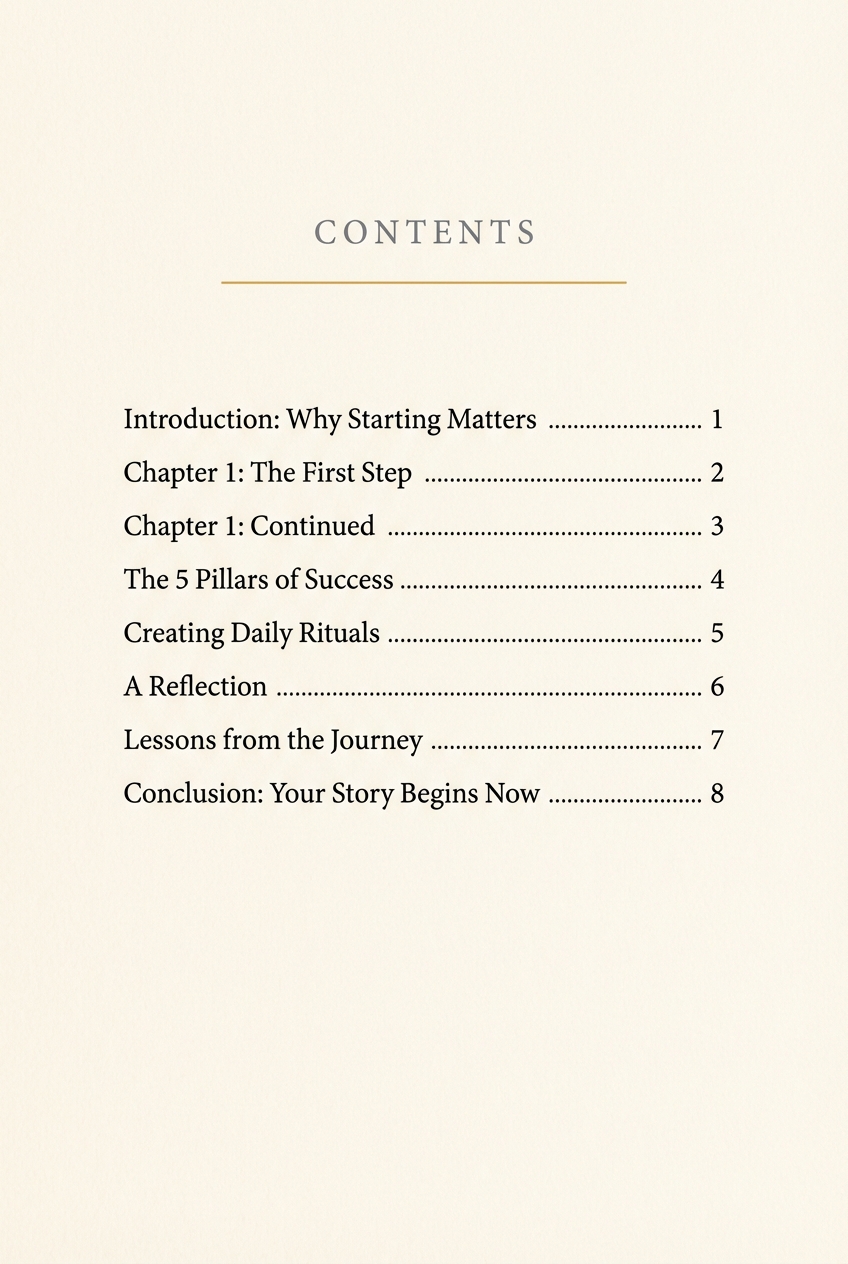
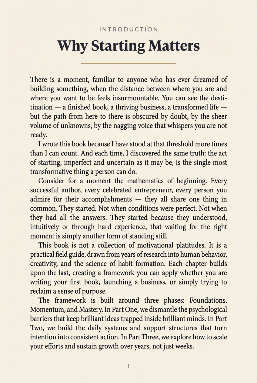
Transform Your Ideas Into Published eBooks
Create professional eBooks effortlessly with Automateed. Whether you're a seasoned author or writing your first book, our AI handles the heavy lifting—perfect for busy creators.
Create Interactive Ebooks with AI
Use AI to create an ebook in minutes — from outline and table of contents to a polished, professional-quality ebook ready to share online. A modern online ebook creator built for content creation at speed, without the page-layout headaches of legacy desktop tools.
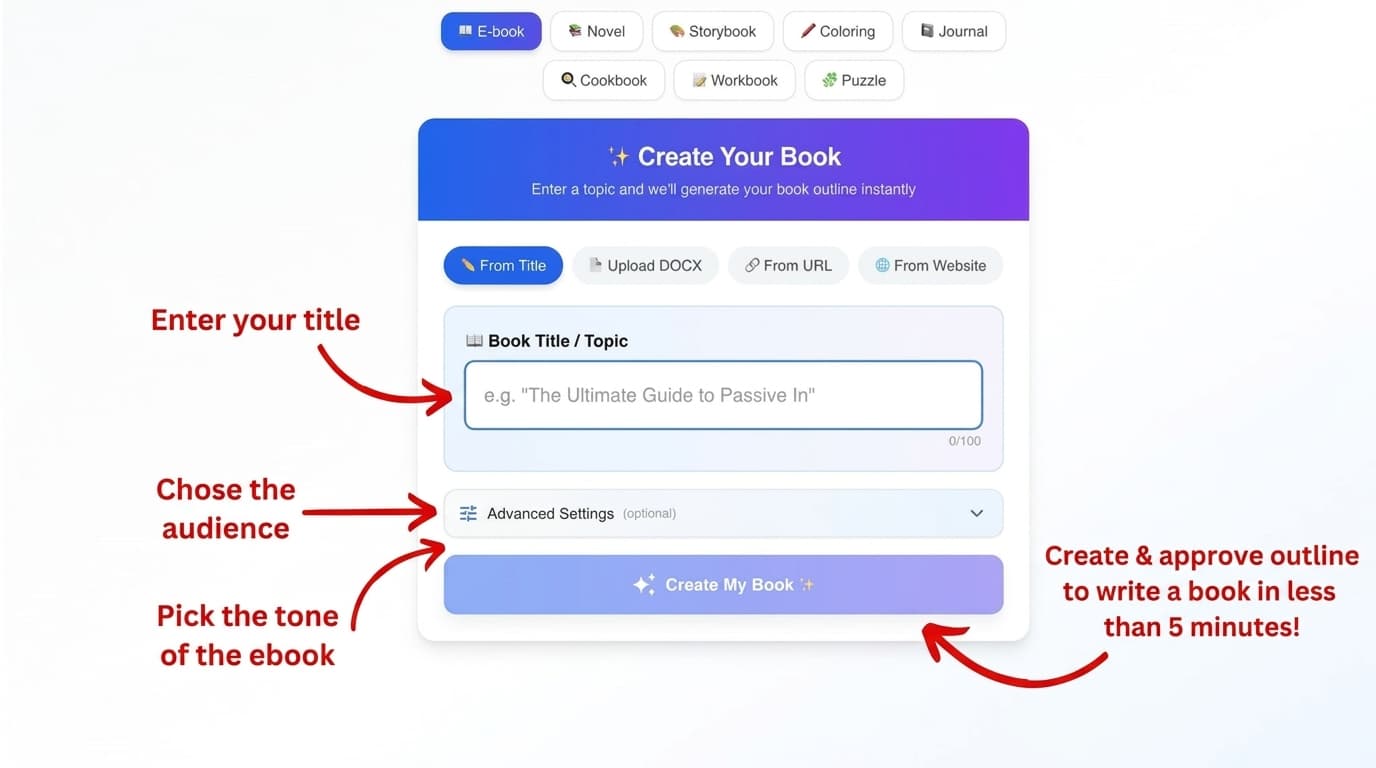
Choose Topic
Pick your ebook topic and define chapters
AI Generation
Watch our AI create professional content
Publish & Sell
Publish in a few clicks on Automateed and start selling
Ignite Your Creative Spark
Our AI doesn't just write—it inspires. Transform your ideas into compelling narratives that captivate readers from the first page to the last.
Professional Content in Minutes
Instead of spending months on your next ebook, simply use this advanced tool to create professional ebooks in a flash. Let our AI handle the heavy lifting—all you have to do is choose your topic, define chapters, and watch our system create a polished manuscript.
Create Illustration Books in Seconds!
Watch how simple it is to create beautiful storybooks with our AI. From concept to completion in just moments.
Ebook Cover Design — Make Your Ebook Stand Out
A stunning cover can make or break your ebook’s success. Design a custom ebook online with simple prompts like “a wolf”, weave images and graphics into chapters, and tune everything to your brand voice — an easier path than wrestling with desktop suites or generic design apps.
Fantasy Genre
Epic fantasy covers

Romance Genre
Captivating romance covers
Children's Books
Magical stories for kids
Included Cover Templates
20 cover styles designed for standout titles and clear typography.
From business and self-help to romance and fantasy—find a style for every genre.
Classic
#1Modern
#2Elegant
#3Bold
#4Artistic
#5Clean
#6Geometric
#7Dynamic
#8Circular
#9Cyber
#10Minimal
#11Monochrome
#12Holographic
#13Vaporwave
#14Editorial Split
#15Paper Collage
#16Classic Alt
#17Modern Overlay
#18Elegant Panel
#19Bold Stripe
#20Risk-Free Trial
Try a short e-book sample first - completely free!
No credit card required. No risk. Just pure AI-powered creativity at your fingertips.
Translate Your Book in One Click
Convert your ebook into virtually any language while preserving formatting, styles, and chapter structure.
- 100+ languages supported
- Keeps headings, chapters, and typography intact
- Optimized for PDF and DOCX export
Available in the editor under: Menu → Translate Book
Customizable Ebook Templates & Page Layout
Pick from print-optimized ebook templates with brand colors, font styles, stock photos and design elements ready to drag and drop. An easy-to-use design surface that gives you professional page layout and design assets without the steep learning curve.
Modern Minimalist
modernElegant Serif
elegantCreative Studio
creativeCorporate Professional
professionalNature Inspired
natureLuxury Edition
luxuryAcademic Journal
academicMagazine Style
magazineModern Minimalist
Modern Minimalist
modernElegant Serif
Elegant Serif
elegantCreative Studio
Creative Studio
creativeCorporate Professional
Corporate Professional
professionalNature Inspired
Nature Inspired
natureLuxury Edition
Luxury Edition
luxuryAcademic Journal
Academic Journal
academicMagazine Style
Magazine Style
magazineGenerate Any Type of Book
From AI Novel to Bedtime Story
eBooks, cookbooks, workbooks, novels, bedtime stories and puzzle books — one ai model and a single ai story generator produces publish-ready content for storytelling that works from romance to sci-fi.
eBooks
Generate complete informational eBooks with chapters, images, and professional formatting in minutes.
- 90+ pages of content
- AI-generated covers
- Export as PDF/EPUB
Novels
Create engaging novels with character development, complex plots, and captivating storytelling.
- Multiple genres
- Character development
- Coherent plotlines
Storybooks
Design illustrated children's storybooks with educational stories and engaging AI-generated images.
- AI illustrations
- Age-appropriate
- Educational themes
Coloring Books
Generate unique coloring books with detailed line art perfect for all ages and niches.
- Line art pages
- Multiple styles
- KDP-ready format
Journals
Create personalized journals with guided pages, reflection templates, and habit trackers.
- Guided pages
- Habit trackers
- Reflection templates
Cookbooks
Generate complete cookbooks with AI food photography, nutritional info, and step-by-step instructions.
- AI food photography
- Nutritional info
- Step-by-step recipes
Workbooks
Create educational workbooks with exercises, quizzes, crosswords, and answer keys.
- 15+ exercise types
- Answer keys included
- All age groups
Puzzle Books
Generate complete puzzle books with crosswords, word searches, sudoku, mazes, and more — ready to publish.
- 20+ puzzle types
- Solution keys included
- KDP-ready format
Ready to create your next book? Start free and generate professional content in minutes.
Become a Published Author
Publish your ebook on the Automateed platform in a few clicks and start selling.
Create Your Free AccountThe Complete AI Book Creator
Toolkit for Full-Length Books & Self-Publishing
From AI-powered writing and ai image generation to stunning ai-powered covers and pro formatting — Automateed covers the entire writing process so you can generate a book, refine character arcs, and keep narrative flow consistency across every chapter.
AI Content Generation
Generate comprehensive chapters with our advanced AI that understands context and maintains consistency throughout your book.

Stunning Visuals
Create professional covers and chapter illustrations with AI-generated images that perfectly match your content.

Smart Editor to Refine, Rewrite & Personalize
Refine, rewrite and personalize every chapter with a smart editor that uses ai technology to tighten narrative flow, fix the ending, and create personalized passages that match your voice — making writing faster and easier than any traditional builder.
Every Ebook Format & Share Ebooks Anywhere
Export to every ebook format you need — PDF, EPUB, MOBI, HTML5 — then download your ebooks, share online, or use them for lead generation. Create and share with one click across any e-reader or platform.
Lightning Fast
Complete your entire eBook in under 10 minutes with our streamlined workflow and powerful AI processing.
Global Reach
Create content in multiple languages and optimize for international markets with built-in localization tools.
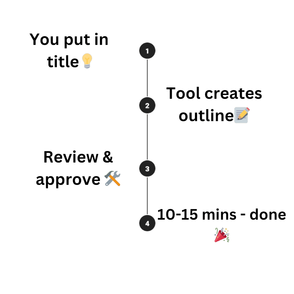
Simple 3-Step Process
Create your professional eBook in minutes, not months
Choose Your Topic
Simply enter your book topic and let our AI understand your vision and target audience.
AI Creates Content
Our advanced AI generates comprehensive chapters, creates stunning visuals, and formats everything professionally.
Download & Publish
Review, customize if needed, and download your finished eBook in multiple formats ready for publishing.
Ready to Create Your Next Bestseller?
Join thousands of authors who've already transformed their ideas into published eBooks with our AI-powered platform.
Designed For Creators Like You
Whether you're a novel writer, a self-publisher with a finished manuscript, or an educator building a course — Automateed lets you write, revise and self-publish in minutes, not months. No publisher, no exclusivity, no giving up your rights.
Aspiring Authors
Transform your ideas into professionally crafted books without spending months writing. Our AI helps you generate complete manuscripts with unique content, cover designs, and formatting—ready to publish on Amazon KDP or any platform.
Digital Entrepreneurs
Build powerful lead magnets and digital products that convert visitors into customers. Create valuable ebooks, courses, and resources that establish your expertise and grow your email list exponentially.
Content Creators & Influencers
Expand your reach beyond social media by packaging your expertise into bestselling books and courses. Turn your knowledge into multiple income streams while building authority in your niche.
Course Creators
Create powerful lead magnets and companion books that dramatically increase course enrollments. Generate workbooks, guides, and resources that add value to your courses and attract more students to your programs.
Creative Writers & Novelists
Overcome writer's block and accelerate your storytelling with AI assistance. Generate plot outlines, develop characters, and create complete novels or story collections faster than ever before.
Marketing Agencies
Deliver exceptional value to clients by creating custom branded ebooks, whitepapers, and marketing materials. Save hundreds of billable hours while maintaining consistent quality across all client deliverables.
Small Business Owners
Establish credibility and attract more customers with professionally written guides showcasing your industry expertise. Create customer resources, training manuals, and marketing materials without hiring expensive writers.
Parents & Teachers
Design personalized storybooks and educational coloring books that engage children in learning. Create custom content tailored to specific age groups, learning objectives, or special interests.
Consultants & Experts
Convert your specialized knowledge into authoritative publications that attract high-value clients. Publish industry guides, research reports, and thought leadership content that positions you as the go-to expert.
Affiliate Marketers
Create valuable bonus materials that increase your conversion rates and commissions. Develop comprehensive guides, comparison reports, and niche-specific content that makes your affiliate offers irresistible.
Bloggers & Writers
Compile your best content into comprehensive ebooks and blog series that generate passive income. Transform scattered articles into organized, sellable knowledge products while building your email list.
Self-Publishers
Accelerate your publishing schedule with AI-powered book creation. Publish multiple titles per month across various niches, complete with professional formatting, covers, and everything needed for Amazon KDP success.
Don't See Your Role?
Automateed is perfect for anyone who wants to create professional books, courses, or content quickly. Our AI adapts to your needs, whatever they may be.
How to Create a Full Book with Our AI Book Creator
We break down the entire workflow — outline, table of contents, chapter drafts — into a single workspace. Use artificial intelligence to generate a story or an entire book chapter by chapter, then refine, rewrite and regenerate any passage until it sounds truly personal.
It's AI for ebook creation made simple, helping you organize your ideas step by step so you can keep track of your progress and produce ebooks from scratch in record time.
From Idea to eBook
The No.1 Online AI Book Creator — Smarter Than Any Generator, Faster Than Any Builder
What once took weeks—or months—now takes less than 15 minutes.
Skip the steep learning curve of legacy desktop suites. Automateed pairs an online ai book writer with a clean drag-and-drop builder so you can write books using powerful tools, export the book in EPUB, PDF or MOBI, and ship it to Amazon Kindle without juggling multiple apps.
No experience in writing?
No problem.
No time?
No problem.
Empower Niche, Subniche, Topic, Title, or Outline Creation
We don't just provide AI to generate your chapters; we help you choose your subniche, define the ebook topic, and even tailor your content to capture your brand's voice.
🎁Over 50 Marketing Tasks for High-Quality Ebooks
Automateed isn't just a tool for creating content. It's an all-in-one platform that suggests marketing angles to boost ebook sales. From building lead magnets to planning email campaigns, we cover it all.
AI-Generated Novel or Informational Book
You can create e-books and instantly publish them on platforms like Kindle or Google Play, maximizing visibility for your potential customers. Each ebook format is carefully optimized for digital readers, ensuring a smooth user experience.
Format, Customize & Download
Stunning cover & Chapter Images Included
Perfect for platforms like Kindle and Google Play
Book Cover & Chapter Images Included
Is This a Free AI eBook Generator?
Free Trial as a Guarantee!
Yes, we offer a free trial of up to 6000 words. We want Automateed AI to be your go-to digital partner, but we understand that sometimes there isn't a good fit.
That's why we let you try a book in one seamless process before committing—no hidden fees or obligations. Zero risks, all rewards 💪🏼.
Give it a go with this free AI ebook writer trial. Get a sample, and if you think there's no compatibility, we'll understand, and you won't have to spend a penny. It's a no-fuss, no-muss guarantee.
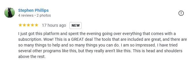
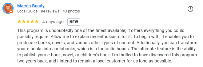
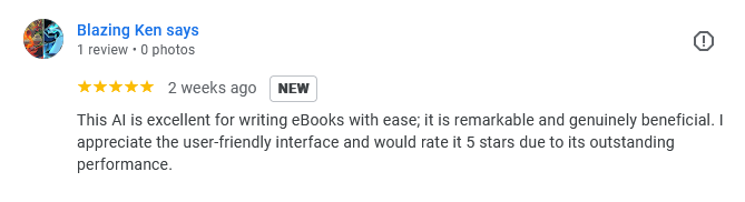
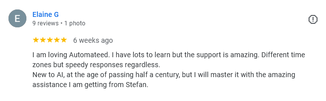
What Our Customers Say
Join thousands of satisfied authors, marketers, and creators who've transformed their content creation process
“With AutomateEd, putting together my ebook was a breeze. The AI-generated content and trendy cover let me publish promptly and start earning sooner than expected.”
– Olivia S.
Author
4.9/5
Average Rating
80,000+
Happy Users
350,000+
eBooks Created
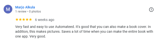
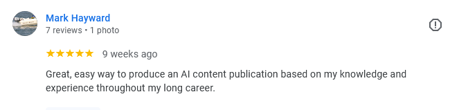
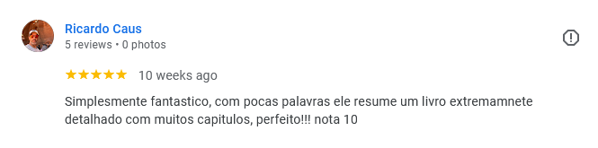
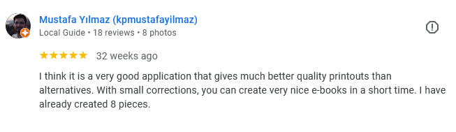
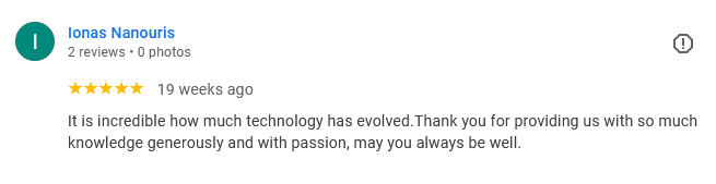
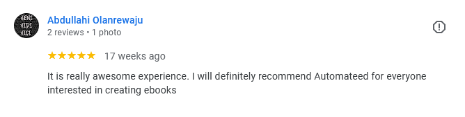
Real Reviews from Google
Don't just take our word for it - see what our users are saying about Automateed on Google Reviews


Ready to Join These Happy Users?
Start creating your professional eBook today and see why our users love Automateed
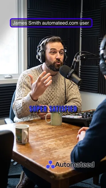
Hear From Real Users
See what our users have to say about their experience with AutomateEd
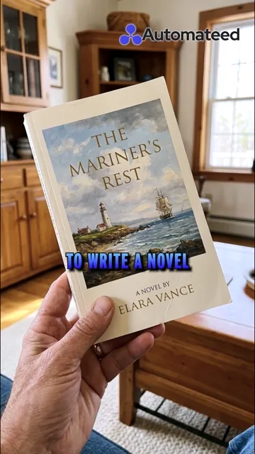


This entire preview (just a short one) was created in 15 seconds using AI.
Yours could be next.
Free to try · No credit card required
Explore our eBook Creation & Marketing Tools
(Click on any to open the tool ↓)
Informational Ebook Subniche Ideas Creator
Dive deep into your niche with our Informational Ebook Subniche Ideas tool. It helps you find specific areas that aren't as crowded, giving your ebook a better chance to shine and attract a dedicated audience.
Novel Ideas Generator
Stuck on what your next big novel should be about? Our Novel Ideas tool throws exciting suggestions your way, sparking your creativity and helping you start your storytelling journey with a bang.
Novel Title Ideas Creator
Find the perfect catchy title for your novel with our Novel Title Ideas tool. It's all about grabbing attention and making sure your book stands out from the rest right from the get-go.
Informational Ebook Niche Ideas
Not sure which niche to tackle in your next ebook? Our Informational Ebook Niche Ideas tool offers fresh insights into profitable niches that cater to your interests and market demand.
Informational Ebook Title Ideas
Get your ebook noticed with a title that piques curiosity. Our Informational Ebook Title Ideas tool helps you craft compelling titles that draw readers in from the very first glance.
Book Summary (Amazon KDP)
Catch readers' eyes with a killer book summary. Our Book Summary tool for Amazon KDP crafts concise, enticing summaries that give potential readers a tantalizing glimpse into your book.
Keyword Research for Amazon KDP
Optimize your Amazon listings with our Keyword Research tool for Amazon KDP. It helps you discover the keywords that potential readers are using, boosting your book's visibility and sales.
Novel Outline Creator
Turn that novel idea into a structured masterpiece. Our Novel Outline tool guides you through the process of building a coherent and captivating story framework step by step.
AI Short Story Generator
Spark the imagination of young readers. Our Short Story Creator for children helps you come up with fun, engaging stories that entertain and educate kids.
AI Short Poem Generator
Delight little ones with rhythmic magic. Our Short Poem Creator for children guides you in crafting short, catchy poems that are perfect for early readers.
AI Course Name Generator
Captivate potential students right away with intriguing course titles generated by our Course Title Ideas tool. It's all about making a great first impression.
AI Marketing Strategy Generator
Plan your path to success with our Marketing Strategy tool. It guides you through creating a comprehensive strategy that aligns with your business goals and market needs.
And Many More Tools Available!
Discover all our AI-powered tools designed to help you create, market, and sell your ebooks successfully.
Create eBooks
From Anywhere 📱
Download our app for iPhone, iPad or Android and create professional AI-powered eBooks right from your pocket.
Scan to Download
Auto-detects your device — iPhone or Android
Rated 4.9/5 by our users
Choose Your
Plan
Pay once, use forever. No monthly fees, no hidden costs.
Pay Once
No monthly payments, ever
Lifetime Access
Use it forever
Credits Reset Monthly
Automatically each month
Entry Lifetime
Monthly Credits
What's Included
- All features unlocked
- Access to 6 free courses
- Free lifetime updates included
- Premium email support
22 of 25 spots claimed
Standard Lifetime
Monthly Credits
What's Included
- All features unlocked
- Access to 6 free courses
- Free lifetime updates included
- Premium email support
- Priority response time
73 of 75 spots claimed
Pro Lifetime
Monthly Credits
What's Included
- All features unlocked
- Access to 6 free courses
- Free lifetime updates included
- Premium email support
- Priority response time
- Early access to new features
47 of 50 spots claimed
Elite Lifetime
Monthly Credits
What's Included
- All features unlocked
- Access to 6 free courses
- Free lifetime updates included
- Priority 24/7 support
- Early access to new features
- Personal 1-on-1 onboarding call
- Dedicated account manager
24 of 25 spots claimed
✅ Secure Payment • ✅ Instant Access • ✅ Lifetime Updates
Learn more about our lifetime deals →Popular AI Tool Reviews
Browse all topics →
Bigfoot Review: Top 10 Sightings and Encounters of 2026

PLR Simple Reviews: Best Sites & Tips for 2026

All Free Novel Reviews: Best Free Book Reviews & Sites for 2026

Find Publishing Help Reviews: Top Self-Publishing Companies in 2026
SportBot AI Review – AI Sports Analytics & Predictions Platform

Best Practices for Honest Affiliate Reviews in 2026

Publisher Rocket Review: Is It Worth It for 2026?

Draft2Digital Reviews: Best Self-Publishing & Ebook Distribution Platform for 2026
Frequently Asked Questions
Everything you need to know about Automateed's AI eBook generator
Still have questions? We're here to help!
Ready to Create Your
First Professional eBook?
Automatically create complete eBooks—150+ pages, images, AI cover, and a ready-to-publish PDF. Start your free trial today.
"Automateed cut our ebook production time from weeks to minutes." — Laura, Marketer
No Credit Card Required
Try all features free for 7 days
Setup in Minutes
Get started immediately with our intuitive interface
24/7 Support
Get help whenever you need it
Publish an Ebook on Your Own Marketplace
Upload your manuscript, choose an eye-catching ebook design from our library of stunning ebooks templates, set your price, and go live in any ebook format (PDF, EPUB, MOBI, HTML5). Skip the hassle of Kindle Direct Publishing — share your ebook online to generate leads, grow your audience, and earn 85% royalties on every sale.
Quick Publishing
Under 5 minutesSimple 4-step process
From manuscript to a professional-quality ebook in under 5 minutes — no Adobe InDesign, no clunky creating tools.
Create account
Sign up and create your publisher profile in under 2 minutes.
Upload manuscript
Upload DOCX. We validate and format automatically.
Edit & polish
Use our AI-powered editor to polish your manuscript and add interactivity — embed a graph, charts, or quiz so readers truly interact with your content.
Publish & earn
Go live on our marketplace. Start earning 85% royalties.
Your book appears alongside 2,500+ published books
Join a thriving marketplace where readers discover quality books daily
Sell books in discounted packs
Bundle multiple books together at a special price. Increase average order value and give readers more value.
Bundle any books
Combine 2+ books from your library into themed collections
Set your discount
Offer attractive bundle pricing to boost sales
Automatic delivery
Buyers get instant access to all books in the pack
Track performance
See which packs perform best and optimize accordingly
Complete Writer's Collection
Everything you need in one discounted bundle
Built-in affiliate program for every publisher
Create custom affiliate links and let others promote your books for commission
How it works
Enable your program
Turn on affiliate tracking in your publisher dashboard. Set your commission rate (typically 10-20%).
Share affiliate links
Generate unique affiliate links for influencers, reviewers, and promoters to share.
Track & pay affiliates
Monitor clicks, sales, and commissions in real-time. Pay affiliates when they drive sales.
Pro Tip: Work with book bloggers, YouTubers, and Instagram reviewers who can promote your books to their audiences!
Reach new audiences
Let influencers and content creators introduce your books to their followers. Expand beyond your existing network.
Performance-based marketing
Only pay when affiliates drive actual sales. No upfront marketing costs—commission is taken from the sale.
Fully automated
We handle cookie tracking, conversion attribution, and affiliate dashboard. You just approve affiliates and set rates.
Example: A book blogger with 50K followers shares your book with their 15% affiliate code. You get sales you never would have reached otherwise!
Powerful book editor included
Our advanced book editor helps you polish your manuscript, add AI-powered enhancements, and prepare your book for publishing—all in one place.
DOCX import
Upload your existing manuscript in DOCX format. We automatically extract and format your content.
AI writing assistant
Enhance chapters, fix grammar, improve readability, and generate missing sections with AI assistance.
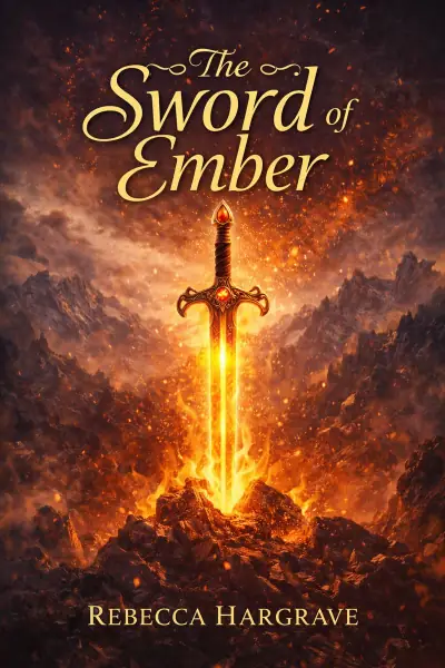
Cover generator
Create stunning book covers with AI. Choose from templates or describe your vision in plain text.
Image insertion
Add and position images throughout your book. Perfect for illustrated books and visual content.
Chapter management
Organize chapters, add table of contents, and structure your book with drag-and-drop simplicity.
Export options
Export to polished PDF or DOCX format. Perfect for KDP, IngramSpark, or direct sales.
Formatting tools
Control fonts, spacing, margins, headers, footers, and page numbers with precision.
Undo/Redo history
Never lose your work. Full edit history with unlimited undo and redo capabilities.
Real-time preview
See exactly how your book will look as you edit. WYSIWYG editor for perfect results.
DOCX upload ready
We auto-check page size, margins, images, and table of contents. Minor fixes are automated; we'll flag anything that needs review. Our editor supports DOCX import, AI enhancements, chapter tools, cover generation, image insertion, and exports to polished PDF.
- AI enhancements and chapter writing
- Line spacing, formatting, undo/redo history
- Embedded images and fonts validation
- Export to refined PDF and DOCX
- SEO-optimized product page
Get paid with Stripe Connect
Automateed uses Stripe Connect to handle payments and payouts. Connect your Stripe account in minutes and start earning from your book sales.
Quick setup
Connect your Stripe account in under 5 minutes. We handle all the technical integration—you just need to verify your identity and banking info.
85%+ royalties
Keep 85% of every sale when using Stripe Connect. Platform takes only 15% to cover hosting, marketing, and transaction fees.
Secure & reliable
Stripe processes billions in payments. Your earnings are safe, and you have full control over payouts directly to your bank account.
Stripe Connect setup steps
Create publisher profile
Sign up and complete your basic publisher information in your dashboard.
Connect Stripe account
Click "Connect Stripe" and follow the secure onboarding flow. You'll verify your identity and add banking details.
Activate payments
Once verified, your Stripe account activates. You can now publish books and receive payments.
Start earning
Publish your books and get paid monthly. Payouts are automated and sent directly to your bank.
Supported countries (42+)
Authors in these countries can connect Stripe Express accounts and receive direct payouts:
Alternative checkouts
Not in a Stripe-supported country? No problem! Use your own checkout URL from platforms like Gumroad, PayPal, or your own website.
- Paste your product link when publishing
- Keep 85%+ of revenue (you handle payments)
- Full control over pricing and refunds
- Book still listed on our marketplace
Complete publishing workflow
From upload to earning, here's exactly how to publish your book on Automateed
Upload your manuscript
Navigate to the Book Editor in your dashboard sidebar. Upload your DOCX file (up to 120MB). We automatically extract text, validate formatting, and create an editable version.
Edit and enhance
Use the book editor to polish your manuscript. Fix typos, improve chapters with AI assistance, add images, and create a stunning cover.
Prepare for publishing
Click "Prepare for Publishing" to convert your manuscript to the ebook format. Add a description, select categories, and generate final preview.
Set price and checkout
Choose your pricing strategy. Set a price for Stripe checkout or add your external checkout URL. Free books are also supported.
Publish and go live
Hit publish! Your book goes live on the Automateed marketplace with SEO-optimized product page, cover image, and secure checkout.
Earn and track
Monitor sales, views, and revenue in your publisher dashboard. Payouts happen monthly via Stripe (or you handle external sales).
Loved by authors worldwide
See what published authors are saying about Automateed
"I published my cookbook in less than 10 minutes. The AI cover generator created something better than I could have imagined. Already earning from sales!"
"The editor is incredibly powerful. I uploaded my Word doc, made some tweaks, generated a cover, and published. 85% royalties is unbeatable!"
"Finally, a platform that doesn't require exclusivity. I sell my books here AND on Amazon. The Stripe integration makes payouts seamless."
Keep more of your earnings with better royalties
Compare our author-first royalty structure to other platforms
Automateed
Amazon KDP
Gumroad
Traditional
Why Automateed is the best choice:
- •Sell anywhere else too: Unlike Amazon's exclusivity programs, you can sell your book on Automateed AND Amazon, your website, Gumroad, or anywhere else—all at the same time.
- •Built-in marketplace: Unlike Gumroad (which is just a checkout), we have a real marketplace with SEO, discoverability, and thousands of readers browsing daily.
- •You keep your rights: You own your book completely. Traditional publishers take your rights and control everything.
- •Best total package: 85% royalties + marketplace + monthly payouts + no exclusivity = more money and freedom than any other platform.
Frequently asked questions
Everything you need to know about publishing on Automateed
Do I need to be exclusive to Automateed?
No! There's no exclusivity requirement. You can sell your book on Amazon, your own website, and anywhere else you want.
How do I get paid?
Connect your Stripe account and receive monthly automated payouts directly to your bank account. You keep 85% of every sale.
What file formats do you accept?
We accept DOCX files up to 120MB. Our system automatically validates formatting and prepares your manuscript for publishing.
Can I edit my book after publishing?
Yes! You can edit your book, update the cover, change pricing, and make improvements anytime through your dashboard.
How long does it take to go live?
Most authors publish in under 5 minutes. Upload your file, choose a cover, set your price, and you're live on our marketplace immediately.
What if I need help?
We offer email support and comprehensive documentation. Our AI-powered editor also includes helpful guides and tooltips throughout.
Ready to publish your book?
Join hundreds of authors earning from their manuscripts. Upload your book, set your price, and start selling in minutes.