Table of Contents
In the fast-paced world of data, staying ahead requires innovative tools. The emergence of AI tools for data analysis has forever transformed how we interpret, process, and act upon vast amounts of data.
These sophisticated algorithms, driven by artificial intelligence, not only streamline the analytical process but also reveal insights that were once hidden. As businesses and researchers rely more on data-driven decision-making, choosing the right AI tool becomes paramount.
But with an array of choices, which tools genuinely revolutionize data analysis? This article aims to guide you through the best on the market.
AI Tools for Data Analysis
1. Tableau
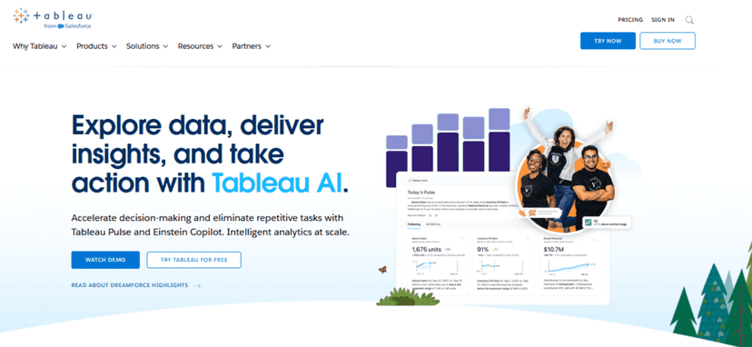
When we chat about top-tier tools for making sense of heaps of data, Tableau often pops up. Why? Well, let’s dive deep and find out!
Tableau’s like that super-smart friend in school who just “got” math. But instead of algebra, it’s all about visualizing your data. This tool takes complex numbers and makes them easy on the eyes with charts, graphs, and interactive dashboards.
Specifications
Designed for both newbies and pros, Tableau offers a user-friendly interface. You can pull data from various sources, whether it’s an Excel sheet, a SQL database, or cloud-based data.
The magic? It turns this data into interactive visuals in no time. Plus, with the drag-and-drop feature, you won’t break a sweat setting things up.
Pricing
- Personal Plan: $70/month
- Aimed for individual use. Perfect for solo projects.
- Professional Plan: $35/month (when billed annually)
- Packs more features. Made for the data gurus out there.
Functionality
Imagine you’ve got a jigsaw puzzle, but instead of pieces, you have bits of data. Tableau’s your buddy that helps put it all together. You get to play around, spot trends, and pull out insights from these visuals. It’s like painting, but with data.
Pros
- Intuitive user interface.
- Handles heaps of data with ease.
- Super flexible with data sources.
Cons
- Can be pricey for some folks.
- Takes a bit to master the advanced features.
How does it compare to other tools?
Now, while Tableau’s ace at what it does, there are other tools in the alley too. Some might offer more analytics features, while others could be lighter on the wallet.
But when it comes to sheer visualization power and user-friendliness? Tableau’s got a strong game.
2. RapidMiner
When the conversation turns to powerful data analysis tools, RapidMiner often finds itself in the spotlight. Let’s uncover its features and see why it’s such a big deal in the data world.
RapidMiner provides a suite of tools that cater to a variety of data tasks, ranging from data prep to machine learning. It’s been recognized in the industry for its capability to provide end-to-end analytics.
Specifications
RapidMiner is known for its robust set of functionalities. It operates on a visual workflow designer, meaning you can “design” your data process without diving into complex coding.
Its flexibility allows integration with various data sources, including databases, cloud data, and even flat files. It supports multiple data formats and boasts advanced machine learning algorithms.
The platform can scale for small to large datasets, ensuring that it caters to both small businesses and big enterprises.
Pricing
- Starter: Free
- Basic data prep and visualization, limited data rows.
- Small: $2,500/year
- Extended functionalities, more data rows, and premium support.
- Large: Custom pricing
- All features unlocked, tailored for heavy-duty analytics.
Functionality
RapidMiner’s strength lies in its versatility. It provides tools for data preprocessing, predictive analytics, and even text mining. With its drag-and-drop interface, you can streamline the data analysis process.
Moreover, for those looking to deep dive, it offers options to integrate custom scripts and extend functionalities.
Pros
- Comprehensive set of data tools.
- No-code to low-code platform.
- Scalable for different business sizes.
Cons
- The learning curve for beginners.
- Premium features can get expensive.
How does it compare to other tools?
RapidMiner stands tall with its vast functionalities, especially when it comes to end-to-end analytics.
While some tools might only focus on visualization or specific analysis tasks, RapidMiner covers a broader range. It might require a bit more investment in terms of time and money, but for many, the payoff in advanced analytics is worth it.
3. IBM Watson Analytics
IBM, a titan in the tech world, brings forward IBM Watson Analytics. It’s more than just a tool—it’s an experience that brings intelligent data analysis to the table.
IBM Watson Analytics is an intuitive, cloud-based solution that offers data visualization, predictive analytics, and cognitive computing capabilities. With the power of Watson behind it, the tool brings a level of smartness to data analysis that few can match.
Specifications
This platform operates on the prowess of natural language processing (NLP). So, you can literally “ask” Watson about your data and get insightful answers. Watson understands the context, patterns, and anomalies in your dataset.
Whether you’re looking to create a visual dashboard or find correlations in the data, Watson has got your back. And, its machine learning capabilities mean the more data you feed it, the smarter its insights get.
Pricing
- Lite: Free
- Access to basic features with limited data capacity.
- Plus: $30/month
- Extended data capacity, more visuals, and advanced AI insights.
- Professional: Custom pricing
- Everything from Plus with additional collaboration features and data connectors.
Functionality
IBM Watson Analytics goes beyond just displaying data. It discovers patterns, predicts trends, and even provides natural language-based query responses. Need to know why sales dipped in July?
Ask Watson! Looking for potential growth areas in the market? Watson’s predictive analytics can show you the way.
Pros
- Rich cognitive computing capabilities.
- Strong predictive analytics.
- User-friendly natural language queries.
Cons
- Might be overwhelming for beginners.
- Higher-end plans can be pricey.
How does it compare to other tools?
IBM Watson Analytics is like the genius in the room. Its cognitive capabilities set it apart from many competitors.
While some tools can help visualize data, Watson goes a step further by providing actionable, smart insights. It’s a tool for businesses that want more than just numbers—they want stories and strategies drawn from their data.
4. DataRobot
DataRobot is the go-to for those looking to dive deep into machine learning without drowning in complex coding. With its user-centric design, you get a touch of AI magic without the usual fuss.
DataRobot offers an enterprise AI platform that makes building, deploying, and maintaining AI solutions smoother than a fresh jar of peanut butter. It aims to democratize data science, making advanced analytics accessible to a broader range of users.
Specifications
The tool automates the entire machine learning process. From data prep to model validation, it’s got it all covered. The platform supports various data formats and integrates with numerous data sources.
With its built-in expertise, DataRobot identifies the best models for your data, so you don’t have to play the guessing game. Plus, its insightful visualizations make complex data stories simple to digest.
Pricing
- Starter: Free trial
- Experience the basic features, limited data processing.
- Standard: Contact for pricing
- Comprehensive machine learning capabilities, more extensive data support.
- Enterprise: Contact for pricing
- Advanced features, integrations, and priority support.
Functionality
The shining star of DataRobot is its automation. Feed it data, and it will guide you through selecting the best machine learning model, tuning it, and getting it ready for deployment. And if you’re worried about biases or errors, the tool’s diagnostic features help ensure your models are as fair and accurate as possible.
Pros
- Comprehensive machine learning automation.
- Informative visualizations.
- Robust model validation and diagnostics.
Cons
- Pricing details aren’t transparent.
- Might have a slight learning curve for total beginners.
How does it compare to other tools?
While many tools promise simplicity, DataRobot delivers, especially in the world of machine learning. It stands out with its commitment to automating complex processes, making AI and data analysis feel more approachable.
If you’ve ever felt like machine learning is just out of your grasp, DataRobot is like that friend who breaks it down and makes it all seem doable.
5. KNIME
KNIME is all about opening the doors to data science for everyone. It’s like having a Swiss Army knife for data analysis; it comes with a ton of tools and extensions for different tasks, all wrapped up in one package.
Founded in Switzerland, KNIME is an open-source data analytics platform. It caters to users looking for robust data integration, analytics, and reporting without being locked behind coding walls. Its nodal workflow makes complex tasks a breeze.
Specifications
The standout feature of KNIME is its visual workflow. Imagine connecting the dots, but each dot is a step in your data process.
Drag and drop, connect, and you’re good to go! It supports various data types and sources, from simple Excel sheets to big databases. Plus, it’s extensible with a ton of free community-contributed nodes.
Pricing
- KNIME Analytics Platform: Totally free
- All core functionalities, no hidden costs.
- KNIME Server: Contact for pricing
- Collaboration, automation, and deployment features.
Functionality
With KNIME, you’re driving the car, but you’ve got a GPS guiding you. Its intuitive interface means even those new to data science can feel at home. Analyze, mold, and visualize your data without diving deep into scripts. And if you ever feel adventurous, KNIME supports integrating scripts too!
Pros
- Super visual and user-friendly.
- Open-source and highly extensible.
- Active community and tons of resources.
Cons
- Might feel a bit overwhelming initially with so many features.
- Server version (for advanced functionalities) isn’t free.
How does it compare to other tools?
KNIME is like that all-you-can-eat buffet where you’re spoilt for choice. It offers a vast array of tools and functionalities, making it suitable for both beginners and pros. While some tools might be great for specific tasks, KNIME aims to be the jack-of-all-trades in data analytics.
6. Alteryx
Ever wanted a magic wand that just waves away the complex parts of data blending and analytics? Alteryx is close to that. It’s like the swiss knife in the camping gear of data enthusiasts.
Alteryx is a platform that specializes in self-service data analytics. With it, data scientists and analysts can cleanse, prep, and blend data from a multitude of sources, then analyze and visualize it.
Specifications
Alteryx boasts a drag-and-drop interface, so you don’t need to get tangled in codes. It supports multiple data sources, be it spreadsheets, cloud-based data, big data, or even non-traditional sources.
The tool also has spatial and predictive analysis capabilities right out of the box. Moreover, you can share your insights with interactive dashboards.
Pricing
- Alteryx Designer: Starts at $5,195 per user annually
- For creating workflows and analyzing data.
- Alteryx Server: Contact for pricing
- Scalability, automation, and sharing.
- Alteryx Connect: Contact for pricing
- A discovery solution for finding and understanding data.
Functionality
Alteryx shines when it comes to blending data from different sources. Got a spreadsheet here, a database there, and some web data? Bring them all together! Plus, its analytical models are a sweet cherry on top. You can also automate tasks, which is a big time-saver.
Pros
- Intuitive drag-and-drop interface.
- Powerful data blending capabilities.
- Inbuilt spatial and predictive tools.
Cons
- Licensing can get pricey for small businesses.
- The learning curve for advanced functionalities.
How does it compare to other tools?
Think of Alteryx as the bridge builder. While some tools are great for analysis and others for prep, Alteryx tries to seamlessly connect the two. Its data blending capabilities are especially strong, making it a favorite among those juggling various data sources.
7. Microsoft Power BI
Imagine a tool that doesn’t just show you numbers, but paints a picture with them. That’s what Microsoft Power BI does. It’s like the artist of the data world, turning data insights into visuals that speak a thousand words.
Microsoft Power BI is a business analytics tool by Microsoft that brings together a variety of data sources to create interactive, immersive dashboards and reports. It helps make sense of large volumes of data and translate it into actionable insights.
Specifications
Power BI has a desktop interface, a cloud service, and mobile apps. It supports a ton of data sources, everything from Excel spreadsheets to cloud services like Azure SQL Database.
There are also customization options with DAX formula language, and the Power Query interface helps in data transformation. Plus, with Power BI visuals, data visualization is a breeze.
Pricing
- Power BI Desktop: Free
- Local data analysis and report creation.
- Power BI Pro: $9.99/user/month
- Collaboration and publishing capabilities.
- Power BI Premium: Varies based on capacity needed
- Advanced administration and large-scale BI deployment.
Functionality
Power BI makes it super simple to create reports with drag-and-drop functionality. The Power BI service allows you to share these reports, collaborate, and even embed them on a website. Plus, with the Q&A feature, you can ask questions and get answers in the form of visuals.
Pros
- Seamless integration with other Microsoft products.
- Highly customizable with DAX and Power Query.
- User-friendly with a short learning curve.
Cons
- Might get a bit complex for absolute beginners.
- Some limitations on data refresh frequency in free version.
How does it compare to other tools?
In the vast ocean of data visualization tools, Microsoft Power BI stands out, especially for those already in the Microsoft ecosystem.
Its deep integration with tools like Excel and Azure gives it an edge. Plus, its pricing is pretty competitive, making it a strong choice for both beginners and seasoned pros.
8. Looker Studio
You know how sometimes you just wish you could get a crystal-clear view of your data without jumping through hoops? Looker Studio is like that magic magnifying glass that lets you see your data in vibrant color and detail.
Looker Studio is part of the Google Marketing Platform. It transforms your data into informative, easy-to-read, easy-to-share, and fully customizable dashboards and reports. It’s perfect for businesses that rely on a quick and interactive data presentation without the tech hurdles.
Specifications
Looker Studio connects to multiple data sources, including Google Sheets, Google Ads, Google Analytics, and even BigQuery. The interface is web-based, so no need for heavy downloads. Plus, it’s loaded with customizable visualizations from simple line graphs to intricate geomaps.
Pricing
- Totally free! Yup, you read that right.
Functionality
It’s all about customization with Looker Studio. Adjust colors, fonts, and layout. Use filters and date range controls.
The drag-and-drop report editor makes everything feel like a walk in the park. Share your reports just as you would with Google Docs or Sheets, and collaborate in real-time.
Pros
- Easy integration with other Google products.
- Highly customizable visualizations.
- Real-time collaboration.
Cons
- Might take a little time to master all its features.
- Some advanced features might be lacking compared to premium tools.
How does it compare to other tools?
Looker Studio is a gem for those deeply entrenched in the Google ecosystem. Its seamless integration with Google products, combined with a price tag of free, makes it a solid choice for many. However, while it covers the basics and a bit more, some advanced users might find a few features missing compared to other premium tools.
9. QlikView
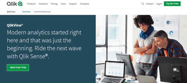
Imagine a tool that dives deep into the ocean of data, bringing up treasures of insights every time. That’s QlikView for you, turning data diving into a smooth sailing experience.
QlikView is a leading data visualization tool that’s been in the game for quite some time. With its associative model, it lets users create and interact with visualizations, dashboards, and apps, making data discovery and analysis a breeze.
Specifications
What makes QlikView stand out is its associative data indexing engine. This engine allows complex calculations on the fly, letting users dig deep without waiting forever. It supports data integration from multiple sources, giving a holistic view. And, of course, it’s designed to be responsive, so it’s as comfortable on mobile as it is on a desktop.
Pricing
- Personal Edition: Free but with some limitations.
- Enterprise Edition: Pricing varies based on requirements. Contact QlikView for specifics.
Functionality
Drag, drop, discover! It’s as simple as that. QlikView offers a plethora of chart types, from bar graphs to scatter plots, all interactive and super responsive. The tool’s dynamic data modeling doesn’t require complex queries or joins. Plus, the in-memory storage ensures super-fast data retrieval.
Pros
- Fast data retrieval with in-memory technology.
- Associative model offers rich, deep dives.
- Integrates data from various sources seamlessly.
Cons
- Might have a steeper learning curve for beginners.
- Licensing can get expensive for larger enterprises.
How does it compare to other tools?
While QlikView offers robust data analysis capabilities, especially with its associative data model, it might intimidate newbies a bit.
But if you’re looking to get deep insights and aren’t afraid of a little learning, it’s a powerful tool to have. Its main competitors in the BI space might offer prettier interfaces, but QlikView is like that wise old sage – a tad traditional but brimming with wisdom.
10. TIBCO Spotfire
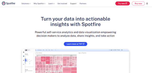
Navigating the complex terrain of data can be daunting. But with TIBCO Spotfire, it feels more like a well-lit path, guiding you through every twist and turn, revealing insights at each step.
TIBCO Spotfire is a cutting-edge data analytics and visualization platform known for its advanced analytics capabilities. Aimed at individuals who need to quickly derive insights from their data, it’s adept at turning raw information into actionable knowledge.
Specifications
When it comes to data handling, Spotfire stands out with its ability to smoothly process large data sets, irrespective of their origin – from intricate databases and web services to simpler flat files.
Its visualization capabilities are commendable, offering users a plethora of options such as scatter plots, heat maps, and even geographical maps enhanced with location analytics.
Beyond mere visualization, the platform seamlessly integrates statistical analysis and predictive modeling, setting it apart in the advanced analytics domain. For those looking for a bespoke experience, its API ensures Spotfire is not just a rigid tool. Users can infuse it with custom algorithms or ingeniously link it with other systems.
Pricing
- Personal Edition: Free for a limited time period.
- Business Author & Consumer: Contact TIBCO for pricing details based on organizational needs.
Functionality
TIBCO Spotfire is a holistic platform. It doesn’t just stop at visualization; it pushes further into realms like predictive analytics, allowing users to look ahead, not just back. Its real-time data analytics and streaming capabilities ensure that businesses can react instantly to changing conditions.
Pros
- Real-time analytics offers a significant edge in dynamic markets.
- Extensive customization options.
- Strong community and plenty of online resources.
Cons
- Some users report a steeper learning curve.
- Might be overkill for smaller businesses with simpler needs.
How does it compare to other tools?
In the realm of data analytics tools, TIBCO Spotfire stands tall, especially with its real-time analytics.
While some of its competitors might offer a smoother initial experience, Spotfire’s depth is hard to beat. It’s akin to a Swiss army knife in the world of data analytics – versatile and packed with features.
11. SAS Visual Analytics
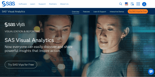
Unveiling the mysteries of data requires a tool that’s not just powerful but also intuitive. SAS Visual Analytics is precisely that tool, offering a harmonious blend of analytical prowess and user-friendly design.
SAS Visual Analytics is a part of the SAS suite, dedicated to data visualization and exploration. It’s tailored for businesses that need to dig deep into their data, uncovering patterns, trends, and hidden insights that can drive strategic decisions.
Specifications
SAS Visual Analytics is more than just a visualization platform. It ensures that data from varied sources gets seamlessly integrated, offering users a comprehensive view. Its drag-and-drop interface promises ease of use, while its robust backend ensures quick processing, even for mammoth datasets.
The platform takes pride in its advanced analytical capabilities, including forecasting, correlations, and scenario analysis.
Moreover, users aren’t restricted to their desktops; mobile reporting means insights are always just a tap away. Personalization is also a key feature, with users having the ability to customize reports, dashboards, and visualizations to suit their unique requirements.
Pricing
- Standard Package: Aimed at mid-sized businesses with moderate data needs.
- Enterprise Package: Crafted for large organizations with extensive data requirements. (Note: Specific pricing details need to be directly acquired from SAS.)
Functionality
SAS Visual Analytics extends its functionality beyond static reports. With interactive dashboards, users can drill down into specifics, ensuring no data point is left unexplored.
The inclusion of AI and machine learning means the platform can also suggest insights, drawing attention to areas users might overlook.
Pros
- Powerful AI-driven insights.
- Flexible and customizable.
- Mobile reporting ensures accessibility.
Cons
- Can be perceived as complex by new users.
- Licensing and pricing might be a barrier for smaller entities.
How does it compare to other tools?
Among the bouquet of data analysis tools, SAS Visual Analytics shines with its AI-driven insights and emphasis on customization.
While the learning curve might seem a bit steep for novices, the depth of insights it offers makes the journey worth it. Its features and capabilities position it as a leading tool for businesses aiming for comprehensive data analysis.
12. Orange
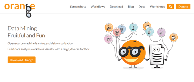
In the vast orchard of data analysis tools, Orange is a unique fruit that offers a combination of simplicity and capability. Its visual programming approach makes it stand out, ensuring that both novices and experts can find value in its offerings.
Orange is an open-source data visualization and analysis tool. With its user-friendly graphical interface, it offers a fresh approach to the often complex domain of data analytics. Built primarily for data mining, Orange also excels in tasks related to machine learning and data visualization.
Specifications
What sets Orange apart is its visual programming interface where users “connect” different components, often referred to as “widgets.”
These widgets can range from data input/output tasks to complex data processing and statistical tests. The emphasis here is on a hands-on, interactive approach, allowing users to visually construct data workflows.
Apart from standard data processing and ML functionalities, Orange also boasts a rich array of visualization tools like scatter plots, box plots, and heat maps. Since it’s open-source, a motivated community continually contributes, ensuring that the tool gets frequent updates and new widgets.
Pricing
One of the most attractive features of Orange is its price tag: it’s entirely free. Being open-source ensures that users don’t have to dig deep into their pockets to leverage its capabilities. This makes it a preferred choice, especially for individuals, educational institutions, and small businesses on a tight budget.
Functionality
Orange provides an extensive widget-based workflow. This means users can build, test, and refine their data analysis workflows by merely connecting different widgets.
The flexibility it offers ensures users can easily shift from one analytical approach to another without significant disruptions. Its integration capabilities are also commendable, allowing users to infuse Python code when needed, thus ensuring they aren’t boxed into a specific approach.
Pros
- Intuitive visual programming interface.
- Extensive library of widgets catering to diverse analytical needs.
- Free and open-source, backed by an active community.
Cons
- While visual programming is its strength, it might not cater to those looking for a more traditional coding experience.
- Might seem less “professional” or “enterprise-grade” compared to some commercial alternatives.
How does it compare to other tools?
Orange’s unique selling proposition is its visual workflow combined with the power of Python.
This ensures it caters to a broader audience, from those taking their first steps in data analysis to seasoned experts. Its open-source nature means it’s continually evolving, but it might not have the extensive support system that some commercial tools offer.
13. Talend
Talend, a giant in the world of data integration and data management, offers a suite of tools that provide end-to-end solutions for various data-related challenges. From big data integration to data quality and master data management, Talend has made its mark by simplifying complex data processes.
Talend is a unified suite of apps designed to help organizations access, manage, and integrate their data. Born in the cloud, Talend is tailored to address both on-premises and cloud data, ensuring seamless integration regardless of where your data resides.
Specifications
Talend’s core strength revolves around its robust data integration capabilities. It enables organizations to connect, cleanse, and share data across different platforms seamlessly. Being built on an open-source foundation, it has expanded its offerings to various specialized products over time.
Notably, Talend brings to the table data preparation tools that enable cleaning and enriching data before diving into analysis. It is adept at big data integration, harnessing the power of modern platforms like Hadoop and Spark.
Talend isn’t just about static data; it’s equipped with real-time data streaming capabilities for capturing and managing data in motion. Another major pillar of Talend is its master data management, which underpins the effort to ensure consistency and accuracy across the data landscape of an organization.
Pricing
- Free Tier (Talend Open Studio):
- Basic data integration capabilities ideal for individual users or small businesses starting with data management.
- Premium Tiers:
- Offers advanced data integration tools, enhanced support, cloud integration, and more. Specific prices and details should be sought directly from Talend, contingent upon the organization’s needs.
Functionality
Talend stands out due to its flexibility. It supports over 1,000 pre-built connectors, ensuring that organizations can connect to various data sources without custom coding.
It also offers a visual designer for data transformation, making it easier to build and deploy data integration tasks. Additionally, Talend’s robust error management and logging capabilities ensure that any data issues can be quickly identified and rectified.
Pros
- Comprehensive suite catering to various data needs.
- Strong support for cloud, big data, and real-time processing.
- Open-source foundation ensures transparency and flexibility.
Cons
- Steeper learning curve compared to some other tools.
- The multitude of offerings can be overwhelming for newcomers.
How does it compare to other tools?
While Talend offers a broad range of capabilities, its strength lies in data integration and big data processing. It’s a formidable contender in the enterprise segment due to its scalability and comprehensive feature set.
However, for smaller organizations or individual users, the learning curve and complexity might be a bit more than what’s needed.
Conclusion
For businesses or individuals diving deep into big data analytics, Apache Hadoop has almost become synonymous with the landscape. Its scalability, fault tolerance, and adaptability to various tasks make it an invaluable asset for handling large datasets.
While the learning curve might be steep, the rewards in terms of insights and data processing capabilities are well worth the effort.