Table of Contents
Ever stared at a blank screen, wondering how to make your newsletter stand out? Trust me, we’ve all been there. Crafting engaging newsletters can feel like a tough gig.
But here’s the good news: there are straightforward steps to turn things around. Stick with me, and we’ll make your newsletters something readers look forward to.
From catchy subject lines to personal touches, let’s explore how to make your newsletters shine.
Key Takeaways
- Craft catchy subject lines to grab attention and boost open rates.
- Structure your newsletter for easy reading with short paragraphs and subheadings.
- Provide valuable and relevant content to keep your audience engaged.
- Add engaging visuals like images and infographics to enhance your message.
- Include clear calls to action to guide readers on what to do next.
- Personalize your messaging to build a stronger connection with subscribers.
- Ensure essential components like a recognizable sender name and social media links are included.
- Monitor performance metrics and adjust your strategy to improve effectiveness over time.

1. Write Catchy Subject Lines
Your subject line is the first thing your readers see, and it can make or break your email open rates.
Crafting a catchy subject line grabs attention and entices your audience to open your newsletter.
Here are some tips to create subject lines that stand out:
- Keep it short and sweet—aim for 50 characters or less.
- Use action words to encourage engagement.
- Personalize it by including the recipient’s name or interests.
- Create urgency or curiosity without being spammy.
- Avoid clickbait; make sure your subject line reflects the content.
Did you know that AI-written email subject lines can increase open rates by 5-10%?
Utilizing AI tools for marketing can help you generate compelling subject lines that resonate with your audience.
Remember, 58% of people check their email first thing in the morning, so a compelling subject line can help you stand out in a crowded inbox.
2. Structure Your Newsletter for Readability
No one likes to read a wall of text.
Formatting your newsletter for easy reading keeps your audience engaged.
Break your content into short paragraphs and use subheadings to guide readers through your message.
Bullet points and numbered lists are great for highlighting key points or steps.
Make sure to use a readable font size and plenty of white space.
Engaging visuals can also help break up text and keep things interesting.
After all, even your best friend won’t stick around if your message is hard to read.
Consider checking out the best practices for writing in the present tense to keep your content lively and immediate.
3. Create Valuable and Relevant Content
Your readers signed up for a reason, so give them content that matters to them.
Focus on providing value in every newsletter you send.
Share insights, tips, and information that your audience can’t get elsewhere.
Stay relevant by covering topics that are timely and interesting to your subscribers.
If you’re writing for a younger audience, you might find these topics for kids to write about helpful in sparking ideas.
Remember, quality content encourages readers to keep opening your emails and can help build a loyal community.
With 99% of users checking their email every day, providing valuable content increases the chances they’ll engage with your newsletter.
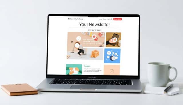
4. Add Engaging Visual Elements
They say a picture is worth a thousand words, and in newsletters, visuals can make all the difference.
Images, infographics, and even GIFs can capture attention and convey your message quickly.
Visual elements break up text and make your newsletter more appealing.
But it’s not just about pretty pictures; your visuals should complement and enhance your content.
Consider using charts or graphs if you’re sharing data or statistics.
If you’re telling a story, include relevant photos to bring it to life.
Just remember to keep file sizes small to prevent slow loading times.
With consumers spending an average of 10 seconds reading brand emails, eye-catching visuals can help you make an impact fast.
Also, ensure your images are optimized for mobile devices since many people read emails on their phones.
And don’t forget to include alt text for images to improve accessibility.
Mixing up your content with engaging visuals keeps your readers interested and more likely to click through.
5. Include Clear Calls to Action
At the end of the day, you want your readers to do something after reading your newsletter.
Whether it’s visiting your website, purchasing a product, or reading a blog post, a clear call to action (CTA) is essential.
Your CTA should stand out and be easy to find.
Use action-oriented language that leaves no doubt about what steps your reader should take next.
Instead of “Click here,” try something like “Download your free ebook now” or “Start your free trial today.”
Limit yourself to one or two CTAs per newsletter to avoid overwhelming your readers.
Also, make sure your CTA aligns with the content of your newsletter.
If you’re discussing a new product, include a link to learn more or to make a purchase.
According to Netcore, the average click-through rate for emails is about 1%, so optimizing your CTAs can help improve this metric.
You might find it helpful to learn how to write in present tense to make your calls to action more immediate and compelling.
6. Personalize Your Messaging
No one likes to feel like just another email address on a long list.
Personalizing your newsletter helps build a connection with your readers.
Start by addressing your subscribers by their first name in the greeting or subject line.
You can also tailor content based on their past interactions or interests.
For instance, if a segment of your audience is interested in children’s books, you might include topics for kids to write about.
Using data wisely can make your emails feel more relevant and engaging.
Did you know that 58% of marketers are confident that AI can improve email newsletters?
AI tools can help you segment your audience and personalize content effectively.
But personalization isn’t just about inserting a name; it’s about delivering content that resonates with each reader.
And with 99% of users checking their email every day, personalized emails have a better chance of being opened and acted upon.
7. Incorporate Essential Newsletter Components
Every great newsletter has some key components that make it effective.
First, make sure you have a recognizable sender name so readers know it’s from you.
Include a compelling headline or header image that grabs attention.
Your content should be concise but valuable, offering something your readers won’t want to miss.
Don’t forget to add social media links so subscribers can connect with you elsewhere.
A clear unsubscribe link is not just a courtesy—it’s required by law in many places.
Also, consider adding a “forward to a friend” option to encourage sharing.
Finally, your newsletter should be mobile-friendly since many people read emails on their phones.
If you’re looking to create an interactive newsletter or even an ebook, you might want to explore how to create an interactive ebook for free.
8. Monitor Performance and Make Adjustments
Sending out your newsletter is just the beginning.
To truly succeed, you need to monitor its performance and make adjustments as needed.
Keep an eye on metrics like open rates, click-through rates, and conversion rates.
If you notice your open rates are lower than the average of 21.5%, it might be time to revisit your subject lines.
Similarly, low click-through rates could indicate that your CTAs need improvement.
Use A/B testing to try different versions of your emails and see what works best.
Remember that email deliverability is important too; with spam placement rates at 6.1%, you want to ensure your emails reach the inbox.
Consider using tools to help with data analysis so you can make informed decisions.
In fact, you might be interested in AI tools for data analysis to help you delve deeper into your email metrics.
By regularly reviewing your performance and adjusting your strategy, you can improve your newsletter’s effectiveness over time.
FAQs
Use concise and compelling language that sparks curiosity. Personalization and urgency can increase open rates. Test different subject lines to see which ones resonate best with your audience.
Keep paragraphs short and use subheadings to break up content. Bullet points and numbered lists enhance scannability. Use a clear hierarchy and include whitespace to make your newsletter easy to read.
Use subscriber data to tailor content, such as addressing recipients by name or segmenting your audience based on interests. Personalized content increases engagement and makes your newsletter more relevant to readers.
Clear calls to action guide readers on what to do next, whether it’s visiting your website, making a purchase, or signing up for an event. They increase engagement and help achieve your marketing goals.