Table of Contents
Fantasy covers in 2026 feel louder, brighter, and way more “designed” than they did a few years ago. I’m seeing a clear shift toward illustration-first art, strong color contrast, and symbolism that reads fast on a phone screen. It’s not just about making something pretty—it’s about getting the right genre signal instantly.
⚡ TL;DR – Key Takeaways
- •Thumbnail legibility wins. High-contrast palettes, simple shapes, and big readable typography are showing up again and again on successful fantasy covers.
- •AI is accelerating exploration. It’s helping authors iterate faster, especially for mood boards and early concepts—though final covers still benefit from human polish.
- •Symbolism is doing the heavy lifting. Crowns, daggers, sigils, creatures, and abstract “magic” visuals often outperform detailed faces at small sizes.
- •The best hiring process is specific. You’ll get better results when your brief includes genre cues, typography preferences, and references—not just “make it fantasy.”
- •Motion is spreading (carefully). Subtle animation for digital listings can help, but it has to stay readable and not steal attention from the title.
How Fantasy Cover Art Has Evolved (and What’s Actually Working in 2026)
A few years back, a lot of fantasy covers leaned heavily on photorealistic characters. In 2026, what stands out to me is how often covers use illustration, collage, and symbolic composition instead. The goal is simple: create a mood and a genre promise without drowning the viewer in tiny details.
Here’s what’s changed in a practical, observable way:
- More contrast, less clutter: Colors tend to be bolder and backgrounds cleaner so the title and key icon read at thumbnail size.
- Fewer “faces” as the main focal point: Many covers use creatures, objects, or abstract magic shapes because they hold up better at small sizes.
- More graphic design discipline: Typography is treated like part of the illustration—not an afterthought placed on top.
- More recognizable genre cues: Crowns, daggers, runes, botanical motifs, and gothic architecture show up because they communicate “fantasy” in a second.
And yes—digital tools matter. AI and advanced illustration workflows make it easier to explore variations quickly (colorways, composition, creature silhouettes, background styles). That doesn’t automatically make a cover “good,” but it does make iteration faster, which is a big deal when you’re trying to hit the right vibe.
Current Trends Shaping Fantasy Cover Design
These are the trends I keep seeing across fantasy subgenres—romantasy, dark fantasy, epic fantasy, and cozy fantasy included:
- Bold palettes that survive compression: Neon-leaning purples, fiery reds, icy blues—colors that still look distinct even when the cover image gets shrunk for ads and storefront grids.
- Symbol-led composition: Dragon silhouettes, glowing crowns, cracked relics, moon-and-forest motifs. If it reads as “fantasy” instantly, it’s doing its job.
- Illustration styles that feel “crafted”: Watercolor textures, vector-like linework, painterly character art, and collage aesthetics. Stock photo realism is less common because it doesn’t feel as unique.
- Light motion for digital listings: Twinkling stars, drifting smoke, subtle shimmer effects. The best ones add atmosphere without making the title unreadable.
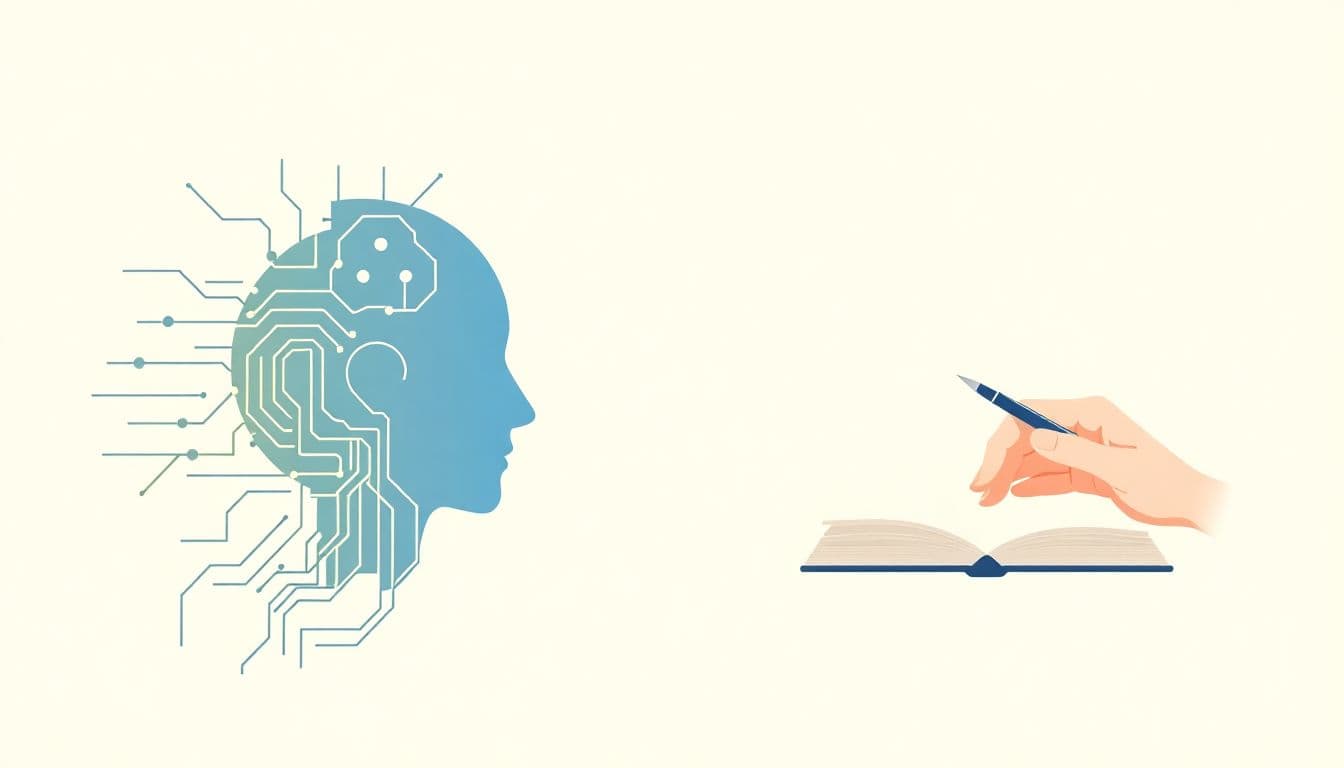
The Real Impact of AI and Digital Tools (Without the Hype)
Let’s be honest: AI tools can produce impressive visuals fast. But the value for cover design usually comes from speed and iteration, not from expecting an AI image to magically solve typography, composition, and licensing in one step.
In practice, many teams use AI in these ways:
- Mood-board generation: Create 20–50 variations to find a palette + visual direction quickly.
- Concept thumbnails: Test composition ideas (where the title will sit, what the focal icon should be).
- Style exploration: Try gothic collage vs. watercolor fantasy vs. clean vector shapes before committing.
- Reference for a human artist: Give the artist a clear visual target so the final cover matches the brief.
Tools commonly discussed by authors include Midjourney and DALL·E for image generation, and cover-focused platforms like AI Cover Creator: Design Professional Book Covers in Seconds for cover-specific workflows. The big difference for cover work is whether the tool helps with cover layout constraints (title space, safe margins, aspect ratios) and file outputs you can actually use.
If you want to explore a cover workflow, start here: https://www.automateed.com/ai-cover-creator/.

Best Fantasy Cover Artists (2023–2026) — and How to Find the Right Fit
“Best” depends on your subgenre and your target reader. A dark fantasy cover that works for one imprint might look off for another. So instead of chasing only famous names, I’d recommend building a shortlist based on style match + typography awareness + portfolio consistency.
Here’s a practical directory-style starting point—famous artists who helped define the look of modern fantasy covers, plus newer names you’ll often see working in today’s illustration-led direction:
Notable Fantasy Cover Artists of 2023–2026
- Gerald Brom — Subgenre: dark fantasy, gritty high fantasy; Style: painterly, gothic mood, bold creature work.
Where to look: portfolios and art collections (search by name + “book cover”).
Typical pricing: varies widely by project; expect premium rates for established artists. - Lewis Royo — Subgenre: fantasy romance, mythic fantasy; Style: vibrant worlds, detailed illustration with strong character/scene energy.
Where to look: official site/portfolio pages and agent listings (search by name + “illustration commission”). - Frank Frazetta — Subgenre: epic fantasy, sword-and-sorcery influence; Style: dramatic composition, high-impact action silhouettes, classic pulp energy.
Where to look: galleries and licensing/representation channels.
For newer creators, you’ll often find strong matches on marketplaces where cover artists share process and finished work. The key is to judge them by cover-ready output, not just standalone illustrations.
- NINC — often shows a polished fantasy illustration approach that can translate well to cover layouts.
- MIBLART — frequently associated with stylized fantasy visuals and modern composition sensibilities.
- DAMONZA — tends to lean into bold, readable fantasy imagery suitable for marketing thumbnails.
Quick note: I’m not claiming exact current pricing for every artist above (rates change, and many quote per brief). Instead, I’m giving you names to start searching with, then using the hiring checklist below to get accurate quotes.
A Hiring Checklist That Actually Prevents Regrets
If you’re hiring a fantasy cover artist (or commissioning AI + a human designer), use this checklist. It’s the difference between “cool art” and “cover that sells.”
- Genre cues: dark fantasy vs. cozy fantasy vs. romantasy (be explicit).
- Composition plan: where will the title sit (top third, center, bottom banner)?
- Icon choice: dragon, crown, sigil, forest silhouette, cracked relic—pick 1–2 hero elements.
- Color constraints: give 3–5 reference covers or describe palette (e.g., “emerald + gold with black ink shadows”).
- Typography direction: serif vs. gothic vs. modern fantasy; do you want the font integrated or separate?
- Deliverables: print-ready (300 DPI), ebook cover file, and any social promo crops.
- Revision policy: how many rounds? what counts as a revision vs. a new concept?
Where and How to Hire Fantasy Cover Designers
Reedsy is a common starting point because it’s built for hiring freelancers and sharing briefs. DeviantArt and ArtStation are also useful for seeing style consistency—but you’ll still want to confirm cover-specific experience.
When you submit a brief, don’t just say “make it epic.” Include references and a one-sentence promise like:
- “I want a cover that reads dark fantasy instantly on a phone screen—high contrast, crown + smoke motif, typography that feels carved/engraved.”
Budget is where most people get surprised. Typical freelance quotes for fantasy cover art often land in the $300–$2,000+ range depending on artist experience, complexity, and timeline. I don’t want to pretend there’s one universal number—so instead of guessing, ask for:
- “What’s included in your quote? (sketches, full color, typography integration, revisions)”
- “What will you deliver? (source files, layered PSD/AI, print-ready exports)”
- “How fast can you turn a first draft?”
For deeper inspiration while you plan your search, you can also check creating fantasy maps—maps aren’t just worldbuilding props. They often give artists concrete shapes, landmarks, and motifs to borrow for the cover.
And when you do communicate with artists: ask for drafts. You want to see the composition and title layout before you commit to the final polish.
Design Principles for Stunning Fantasy Book Covers (2026 Edition)
Great fantasy covers don’t rely on one trick. They combine readability, genre signaling, and visual storytelling.
In 2026, the “winning formula” tends to look like this:
- High contrast so it reads in a grid.
- Big typography that doesn’t get swallowed by the illustration.
- A clear focal icon (dragon silhouette, crown, sigil, relic, moon portal).
- Atmosphere (smoke, stars, mist, gothic architecture shapes) that supports the story mood.
Also, don’t ignore practical layout constraints. A cover that looks amazing at 2,000px wide can fall apart when it’s shrunk to a 180px thumbnail.
Visual Elements That Make a Cover Pop
Here are elements that consistently help fantasy covers stand out:
- Silhouettes: A dragon silhouette against fiery reds and deep black shadows reads instantly—even when the details blur.
- Icon + glow: A glowing crown, rune, or enchanted blade can act like a “light source” behind the title.
- Geometric structure: Triangles, arcs, and layered frames guide the eye toward the title.
- Botanical accents: Floral motifs work especially well for romantasy and whimsical fantasy—just keep them stylized so they don’t turn into visual noise.
Motion effects are more common now too. But if you’re going animated, keep it subtle. The title should still be the anchor.
Symbolism and Abstract Art in Fantasy Covers
One reason symbolism is so popular: it’s flexible and reads well. A detailed face can get lost. A cracked crown? A dagger with a rune trail? Those hold up.
- Skull / dagger / sigil: communicates danger or magic without needing a full character portrait.
- Abstract shapes: evoke timeless fantasy vibes and let the title stay clean.
- “Broken” icons: like a cracked crown or melting dragon suggest conflict and mystery right away.
If you want inspiration for how covers visually “tell” story, browse cover concepts and typography examples here: Book Cover Design Inspiration. Use it like a reference library, not a copy-paste template.

Practical Tips for Market-Effective Fantasy Covers (What to Do Before You Pay)
Before you finalize anything, test your cover like a reader would. Shrink it. Crop it. Imagine it in a scroll.
- Thumbnail test: view the cover at 10% size. If the title disappears, the design needs simplification.
- Contrast check: make sure the title color isn’t competing with the brightest part of the illustration.
- One hero element: pick the main icon and build everything around it.
- Genre clarity: if your cover could be mistaken for sci-fi or romance, you’ll lose the right readers.
And if you’re thinking about animation—don’t treat it like a gimmick. Use it for atmosphere.
Animation and Motion Effects (When They Help, When They Hurt)
Subtle motion—twinkling stars, drifting smoke, flickering embers—can make your listing feel alive. But it only works if:
- the title remains readable in motion
- the animation doesn’t cover the focal icon
- the effect matches the cover’s lighting and mood
Some cover tools and platforms support animated formats for digital listings. The exact output formats can vary by tool and platform, so when you’re planning an animated cover, ask for the deliverables you’ll need for your storefronts (and whether they support the formats you plan to upload).
For fantasy-world inspiration that can translate into cover motifs, you can also explore writing believable fantasy. The more specific your world details are, the easier it is to design symbols that feel earned—not generic.
Balancing Illustration and Symbolism (So It Doesn’t Look “Random”)
Here’s what I like to aim for: illustration gives emotion, symbolism gives clarity.
- Illustration: a painterly scene, a watercolor creature, a stylized hero silhouette.
- Symbol: a glowing dagger, an enchanted floral motif, a rune trail, a moon portal.
- Typography integration: the letters should sit naturally in the composition, not float over it.
Example concept (simple but effective): a hero silhouette holding a sword, with a mystical landscape behind them—and a single symbolic object (like a rune-etched blade) acting as the visual “hook” that anchors the title.
Common Challenges (and How to Fix Them Fast)
Most cover problems are predictable. Here are the big ones I see, plus what to do instead.
- Problem: the cover looks great large, but awful small.
Fix: simplify shapes, reduce tiny textures behind the title, and increase contrast around the typography. - Problem: it feels generic.
Fix: replace “vibes” with specific symbols (one crown, one sigil, one creature motif) and use a palette that matches your subgenre. - Problem: you over-specify the story.
Fix: leave some mystery. Too many literal details (faces, too many objects) can make the cover busy. Let the reader imagine the rest. - Problem: motion distracts from the title.
Fix: keep motion in the background and avoid animating the area behind the name.
If you want to align your cover cues with reader expectations, revisit your genre comps (the top 10–20 covers in your category). Then adjust your design language so it feels like it belongs there—but still stands out.
For more writing-world alignment (which helps artists design smarter symbols), see writing epic fantasy.
Latest Industry Standards and Future Predictions for 2026
What I expect to keep growing in 2026:
- Illustration-led covers that look handcrafted, not generic.
- Bold, symbolic design systems (consistent motifs across series books).
- Digital-first optimization (thumbnail legibility treated as a requirement, not a bonus).
- Careful animation for eBook marketing—more common, but still constrained by readability.
- Series branding consistency: recurring icon shapes, palette rules, and typography style across all books in a line.
Also, tools will keep improving. But the best covers will still come from strong direction: a clear brief, smart references, and someone who understands layout and typography.
Conclusion: Your Next Steps for a Fantasy Cover That Actually Performs
If you want a fantasy cover that feels right for 2026, focus on three things: readability, genre signaling, and visual coherence. That’s how you get a cover that looks good in a scroll and still hits emotionally up close.
Here’s a quick next-step checklist I’d use before you commit:
- Pick 5 reference covers (not just “similar”—actual comps in your subgenre).
- Write your brief with 3 symbols + your palette + where the title should sit.
- Do the thumbnail test (and fix contrast/typography before final art).
- If using AI, treat it as iteration support—then confirm licensing and finish with cover-ready design.
- Ask your artist/tool for the exact deliverables you need for Amazon/ebook formats.
A great cover is your first impression. Make it count.

FAQ
How do I find a fantasy cover artist?
Start with platforms like Reedsy and portfolio hubs where artists share cover work (Reedsy, ArtStation, DeviantArt). Don’t just look at the art—look for cover layouts, typography integration, and whether the artist’s style matches your subgenre. Then send a brief with references and clear deliverables.
What are the best fantasy cover artists of 2023?
Legendary illustrators like Gerald Brom, Lewis Royo, and Frank Frazetta continue to influence cover aesthetics. For the “best” in 2023–2026, though, I’d also focus on newer artists whose recent portfolios show modern digital-first design (bold palettes, readable titles, strong symbolism).
How much does a fantasy book cover cost?
Costs vary a lot. Many authors report professional fantasy cover commissions ranging from about $300 for emerging artists to $2,000+ for top-tier specialists—depending on complexity, revisions, and timeline. The best way to get an accurate number is to ask for a quote tied to specific deliverables and revision rounds.
Where can I hire a fantasy cover designer?
Reedsy is a popular option for hiring cover designers because you can submit a detailed brief and compare artists by portfolio. Just make sure you review their cover-specific work and confirm what’s included (drafts, revisions, final file formats).
What makes a great fantasy book cover?
A great fantasy cover combines bold, readable typography, strong genre cues (symbols and motifs), and composition that holds up as a thumbnail. It should feel cohesive—like every element is there for a reason, not just decoration.