Table of Contents
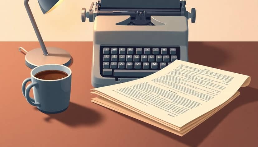
Getting your book manuscript ready to send out feels pretty intimidating, right? All those formatting rules can seem annoying, especially when you’re itching to get your story out there. But honestly, a well-formatted manuscript makes you look professional and boosts your chances.
Stick around, because I’m about to make formatting way easier for you. We’ll cover everything you need, from fonts and spacing, margins and titles, to headers and page numbers. In short, I’m going to help you impress those publishers and agents with a clean, clear manuscript.
Ready? Let’s jump right into the essentials.
Key Takeaways
- Stick with standard fonts like 12-point Times New Roman, Courier New, or Arial to clearly present your manuscript.
- Set one-inch margins all around and indent new paragraphs by half an inch using the Tab key—no extra paragraph spacing needed.
- Always double-space the entire manuscript text, removing unnecessary spacing between paragraphs.
- Place page numbers and a header with your last name at the top-right corner, starting from the second page.
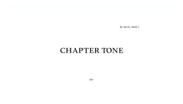
- Center your chapter titles one-third down each new chapter page, capitalize them (CHAPTER ONE), and keep formatting simple.
- Clearly indicate the end of the manuscript with “#” or “-30-” under the last paragraph.
- Always double-check publisher or agent formatting guidelines and maintain consistent formatting style throughout.
Use Standard Font and Size
When formatting your book manuscript, you definitely want to stick with what’s tried and true. Agents and publishers typically expect 12-point Times New Roman, though Courier New and occasionally Arial can also get a free pass.
Why Times New Roman? Simply put, it’s clean, professional, and easy on the eyes, making it easier for editors to read thousands (seriously, THOUSANDS) of words daily without squinting or battling headaches.
Here’s the scoop on picking your font:
- Set the entire manuscript to 12-point size, no exceptions.
- Avoid fancy fonts like Comic Sans or Papyrus—they scream “rookie” louder than neon letters.
- Stick to black ink on white background; simplicity always wins.
Pro-tip: Set your font choice upfront in software like Microsoft Word or Scrivener to apply automatically throughout your manuscript, avoiding tedious manual corrections later.
Set Proper Margins and Indentations
For manuscript submissions, publishers and agents consistently expect one-inch margins on all sides. These requirements aren’t arbitrary; generous margins let your editor scribble down notes (good or bad) without cluttering your text.
So, how do you nail the margins and indents instantly? Simple steering:
- Navigate to Page Setup (usually under File or Layout).
- Set all four margins—top, bottom, left, and right—to 1 inch (2.5 cm).
Now let’s talk about paragraph indentation. Every new paragraph should start with a half-inch indent—one easy tap on your keyboard’s Tab key.
And a quick heads-up: avoid spacing paragraphs by hitting Enter twice; this is an amateur giveaway. Let your indentation signal that you’ve started a new paragraph, and keep spacing consistent throughout your manuscript. If you want to understand more about paragraph formatting standards, here’s a helpful explanation of how to format dialogue properly in your story.
Apply Correct Line Spacing
Yes, double-spacing your manuscript is still the undisputed standard in the publishing industry for 2025. Why? Editors and agents rely on double spacing as they jot down suggestions and corrections comfortably between your lines. This spacing is non-negotiable unless specifically stated otherwise by submission guidelines.
Here’s your straightforward game plan for handling line spacing:
- Highlight your entire document (Ctrl+A or Command+A).
- Head over to your Paragraph formatting menu and pick “Double” under Line Spacing.
- Turn off any additional spacing before or after paragraphs—that extra spacing setting can seriously mess up the professional look you’re aiming for.
Remember, consistency here is key—getting this step right won’t just make your manuscript more readable; it’ll make you look professional and attentive to detail, significantly boosting your chances of moving ahead in the publishing process.
Add Page Numbers and Headers
Yes, you definitely need to include page numbers and headers when you format your manuscript—not just because they’re industry standards, but they make editors’ and agents’ life much easier.
Imagine your editor accidentally knocking your manuscript off their desk, pages scattering everywhere (trust me, it happens)—without clear page numbers, they’re going to have a mini meltdown piecing it all back together.
Here’s exactly how you set up page numbers and headers in your manuscript:
- In Microsoft Word or Scrivener, just head to the “Insert” menu and tap on “Page Numbers.”
- Align numbers to the top right corner—this placement is standard across the industry.
- Add your header, typically your last name followed by a simple slash or dash (Smith — 1).
It’s common practice to exclude the header and page number from the first page (usually your title page), and begin numbering from page two onward.
And here’s a quick trick: you can set your document to automatically number pages—all it takes is a few clicks and you’re done.
Format Chapter Titles Clearly
Your chapter titles shouldn’t just drift into the text—they need to stand out clearly.
Why? Well, clarity is key for editors who’re reading countless pages of manuscripts every week.
Standard formatting for chapter titles means centering the words a third of the way down the page (roughly three inches or 8 cm from the top margin) in bold face and capitalized letters—CHAPTER ONE, CHAPTER TWO, you get the picture.
Skip four double-spaced lines, then type your chapter title or begin your chapter text without indenting.
Need a visual? Do a quick online search for professionally formatted manuscript samples or check out online guides like examples of how to format your book and even best fonts for book covers if you’re designing yours.
Another tip: Avoid fancy font choices or unnecessary formatting—stick to simplicity and clarity to impress publishers and editors.
Mark the End of Your Manuscript
After weeks, months, or let’s be real—years—finishing your book feels amazing, and marking “The End” can feel pretty ceremonial.
But editors and agents aren’t psychic (shockingly!), so you need to clearly show them it’s over.
The industry usually recognizes a simple hashtag or placeholder centered beneath the final paragraph—either “###” or “-30-” works perfectly (no need to overcomplicate here).
This signals to whoever picks up your manuscript that no pages are missing, preventing confusion and possible rejection due to incomplete-looking manuscripts.
Keep in mind: Happily typing “The End” isn’t technically wrong, but it’s a bit outdated and can hint at amateur status—stick to what’s expected and professional instead.
Check Publisher or Agent Guidelines
This one might seem obvious, but you’d be shocked at how many aspiring authors skip this step.
No two publishers or literary agencies are exactly alike, and sometimes they throw curveballs—special formatting quirks, file type requests, font preferences, or submission details.
You don’t want to get rejected simply because you didn’t bother to look at their rules carefully.
Absolutely visit the publisher or agency website and hunt down their formatting requirements—most have it clearly stated in their submission guidelines section.
You might even find valuable nuggets of info to help you tackle publishing decisions, like whether you need an agent—helpful resources include articles on how to get a book published without an agent or finding steps to publish a graphic novel.
Bottom line: always tailor your formatting to the specific publisher or agent—it shows professionalism, care, and respect for their process.
Maintain Style Consistency
No one likes inconsistency—it distracts readers and screams amateur hour, turning publishers away real fast.
Maintaining consistency refers to everything—your margins, spacing, indentation, fonts, alignment, punctuation rules, and even capitalization throughout your manuscript.
Here’s a handy solution: create a style guide either digitally or physically (a quick list works fine) noting down exactly how you formatted everything, and keep referencing it as you write or edit.
Avoid shifting between single and double quotes, American and British spellings, changing character names unintentionally, or varying indentation.
Review your manuscript multiple times after finishing to check for these tiny-but-distracting errors—or better yet, hire or request a beta reader to do the consistency check for you.
Speaking of beta readers, if you haven’t already considered this vital feedback step, take a moment to learn exactly how to become a beta reader, or find one to evaluate your manuscript professionally.
Remember, consistency isn’t flashy—but getting this right will significantly upgrade the odds your manuscript is seen as polished, professional, and ready for publication.
FAQs
The industry standard for manuscript formatting is Times New Roman or Courier New at 12-point size. This ensures comfort for readers and helps meet the typical expectations of editors, agents, or publishing professionals reviewing your manuscript.
Typically, manuscripts require one-inch margins on all sides to ensure readability. Indentations for paragraphs usually are half-inch (around five spaces) from the margin, set automatically through the word processor rather than by hand spacing.
Double spacing is the standard line spacing for manuscripts. It gives editors or agents enough room for markup or editing notes. Be consistent throughout, including between paragraphs and sections, unless guidelines specify something else.
Yes, every manuscript page requires numbering, often placed in the top-right corner. Most submissions include headers containing author’s last name, title keyword, and page number. Always follow the guidelines given by your publisher or literary agent.