Table of Contents
For a novel or text-based guide, use a reflowable EPUB—you don't need to choose a fixed page size in inches. The text adjusts to the reader's screen and font settings. For a picture book or comic where words must stay beside specific artwork, consider fixed layout instead. Apple's EPUB layout guidance makes the same distinction between mostly text and designs that depend on their page composition.
For a printable PDF, choose an actual paper size: US Letter is 8.5 × 11 inches; A4 is 210 × 297 mm. These are useful worksheet formats, not universal ebook dimensions. Adobe’s paper-size reference gives these measurements. For a picture book or comic, start with the artwork’s proportions and check the destination platform’s fixed-layout requirements before committing to a canvas.
Which size should you choose for your book?
Start with how people will read the book. A novel on a phone needs a different approach from a worksheet someone will print at home. The table below gives you a starting point for each kind of content, so you can choose the format before spending time adjusting page dimensions.
| Book type | Recommended starting format | Page-size decision |
|---|---|---|
| Novel, memoir, essay collection | Reflowable EPUB | Do not impose a physical page size on the reading edition |
| Text-led nonfiction with occasional illustrations | Reflowable EPUB | Plan flexible text, inline images, and compact tables |
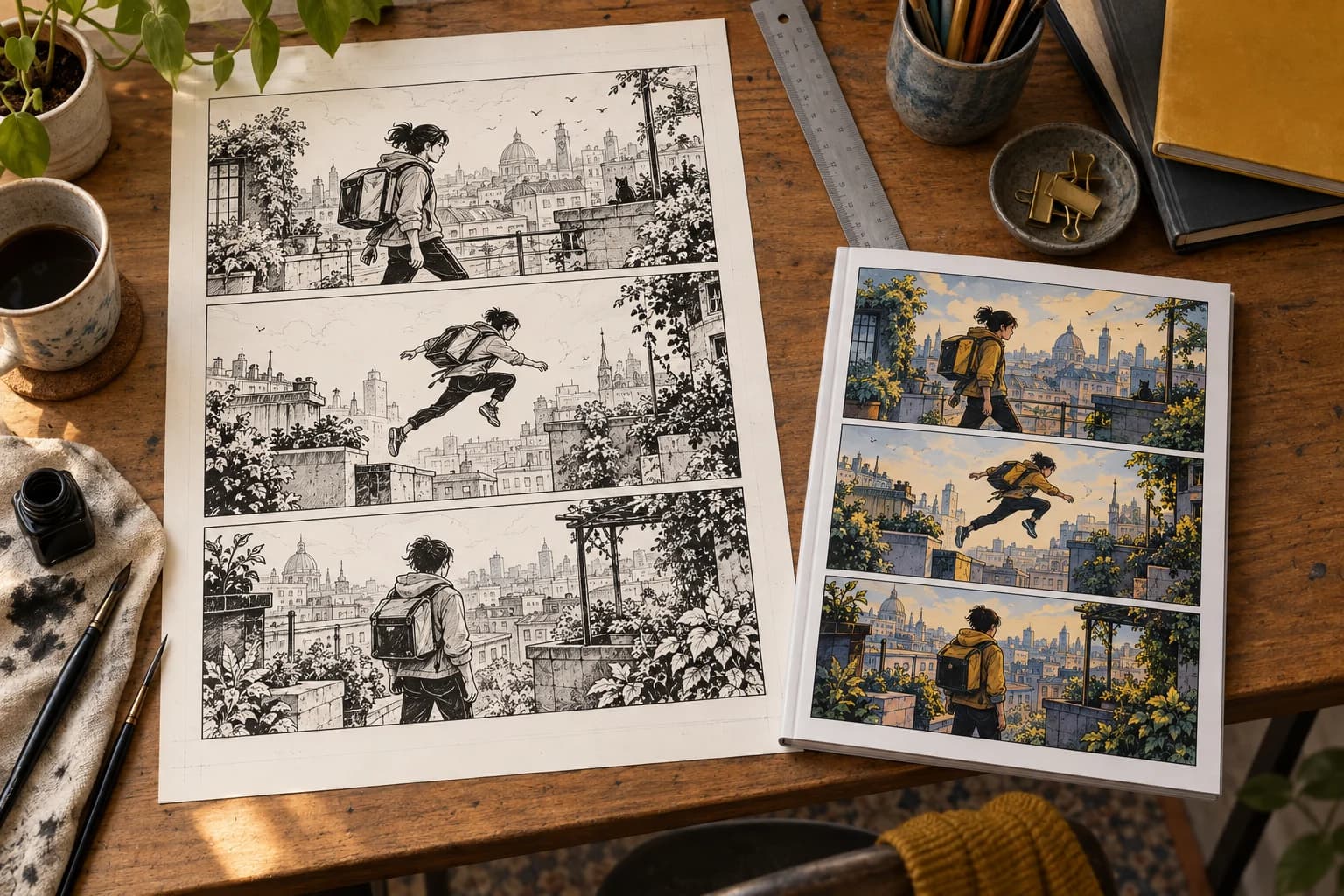
| Children’s picture book | Consider fixed-layout EPUB | Choose a canvas that preserves the essential relationship between words and artwork |
| Comic or graphic novel | Consider fixed-layout EPUB | Preserve panel order and assess the smallest readable view |
| Workbook or home-printable worksheet | Match the paper and writing space readers need | |
| Paperback or hardcover | Printer-ready interior | Select a supported trim size, then apply the printer’s specifications |
The EPUB 3.3 specification defines the underlying EPUB distinction as reflowable versus pre-paginated content. A useful editorial test is to ask: would moving the illustration below its paragraph preserve the meaning? If yes, try reflowable first. If moving words away from the artwork would obscure who is speaking or which object a label identifies, investigate fixed layout.
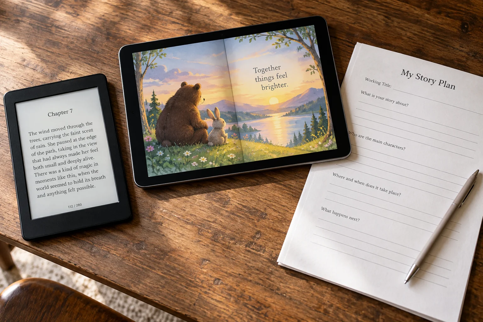
Reflowable EPUB has no fixed physical page
A reflowable EPUB lets the reading system arrange the content instead of reproducing a sheet of paper. Amazon’s guidance on reflowable Kindle books identifies text-heavy fiction and nonfiction as suitable when text can be separated from images without losing essential context or design. Readers can change text and formatting settings.
Think in terms of what belongs together: a heading and its section, a picture and its caption, a note and the passage it explains. Good ebook formatting preserves those relationships while letting lines move. You don't need to decide the exact screen position of every sentence.
For the reading edition, focus on these basics before worrying about how many screens a chapter occupies:
- Keep the main text in one clear reading sequence.
- Use distinct styles for headings, paragraphs, lists, and quotations.
- Make spacing express structure rather than imitate a printed page.
- Keep illustrations close to the passages that explain them.
- Provide a navigable table of contents.
- Start chapters deliberately, without inserting empty pages.
- Check that readers can enlarge the text without losing content.
Use a link such as “Preparing the materials” instead of “see page 42.” The section title still helps when the text moves onto different screens. If readers also need to match a print edition, arrange that page mapping separately instead of typing fixed page numbers throughout the ebook.
Your Word page size won’t control the Kindle screen
Use your word processor’s paper size for drafting, not as a promise about the exported EPUB. Apple explicitly lists page size among the document features retained only in fixed-layout EPUB exports in its Pages export documentation.
For Kindle reflowable content, Amazon’s reflowable text guidance advises relative units instead of fixed points or pixels for layout properties. It specifies percentages for horizontal margins on special blocks and ems for vertical spacing, while normal body text should leave horizontal margins to the reader. It also warns against fixed heights on text containers.
Before export, check for these common print-formatting shortcuts. They can cause problems once the text starts flowing around a smaller screen:
- Line breaks after every visible line: restore ordinary paragraphs, except where lineation carries meaning, such as verse.
- Blank paragraphs before chapters: use the exporter’s chapter-break mechanism.
- Typed headers, footers, and page numbers: remove the print furniture without deleting meaningful numbered content.
- Positioned text boxes: move their contents into a sensible reading order.
- Desktop-width tables: simplify or divide them where the comparison allows it.
- Paragraphs embedded in pictures: restore live text wherever the composition permits.
Keep an untouched copy before changing the layout. Review the replacements rather than deleting every break automatically. Space between scenes may need a visible separator, while line breaks inside a poem may be essential. The aim is to remove accidental page formatting without losing the structure that carries meaning.
When fixed layout is the right choice
Choose fixed layout when the composition carries information that ordinary text flow would lose. A speech balloon pointing toward a character is a stronger reason than a preference for decorative chapter-opening space. The W3C notes that pre-paginated content can restrict reader styling, with consequences for usability and accessibility, in its EPUB specification.
For the Kindle image-pop-up and virtual-panel formats covered by Amazon’s fixed-layout metadata guidance, the required original-resolution metadata describes the design canvas. Its dimensions must preserve the original content’s aspect ratio. A sample resolution in that documentation is not a recommended size for every ebook or a requirement for every EPUB workflow.
Before commissioning all the artwork, settle these choices with one sample page or spread. It's much easier to change a sample than a finished book:
- Identify the intended page unit. Decide whether the composition is a single page or a spread. Mark anything that crosses the center.
- Preserve the artwork’s proportions. Avoid stretching a finished illustration to fill a differently shaped screen.
- Set a small-screen reading requirement. Determine which words must be readable at fit-to-screen size and which may use enlargement.
- Check orientation and enlargement support. Confirm the chosen format’s behavior on the stores and reading apps you intend to serve.
- Budget for alternate treatments. Plan whether another store needs different panel navigation, text placement, or export settings.
Choose a demanding sample, with the smallest labels, busiest illustration and longest text passage. View it at the size readers will actually see. If you have to zoom constantly, revise that page before repeating its design throughout the book. A layout that looks impressive on your monitor may still need a simpler version for a phone.
EPUB page size is not PDF page size
For a PDF, you do need real page dimensions. Choose them according to whether readers will print at home, use a commercial printer or read only on screen. A printable worksheet and a reading PDF may contain the same information but need different spacing, margins and text sizes.
- US Letter, 8.5 × 11 inches: a sensible worksheet choice when your readers will use Letter paper.
- A4, 210 × 297 mm: choose this when readers will print on A4.
- A5, 148 × 210 mm: consider this smaller page for a compact fixed-page guide, then check the resulting text size rather than simply shrinking an A4 design.
These measurements come from Adobe’s A-series and Letter size reference; the use cases above are starting recommendations, not ebook standards.
Leave enough space for handwriting on a worksheet and keep important text away from the edges. If you offer Letter and A4 versions, check both exports. A box or writing line that works on one page shape may become cramped on the other. Print an actual-size sample before asking readers to rely on it.
For a screen-only PDF, test one representative page on the smallest intended display. Reduce needless columns and wide decorative margins before shrinking the letters. Choosing a smaller paper size won't help much if you simply squeeze the same crowded layout into it. Redesign the page so the content remains comfortable to read.
For the separate Automateed workflows, consult the PDF template controls when preparing fixed pages and the EPUB export when preparing the ebook edition. Check the exported files themselves rather than assuming the two outputs share layout settings.
Ebook page size is not print trim size
Choose trim size for the physical book independently of the reflowable edition. Trim specifies the finished printed width and height; bleed may require a larger interior file. Amazon explains both in its trim, bleed, and margin instructions.
For example, KDP lists a 6 × 9-inch interior without bleed and a 6.125 × 9.25-inch interior page with bleed for that trim. Those dimensions apply to this print workflow, not to a reflowable Kindle book. Follow your own printer’s specification instead of transferring the example to another service.
Keep the shared manuscript separate from these output decisions:
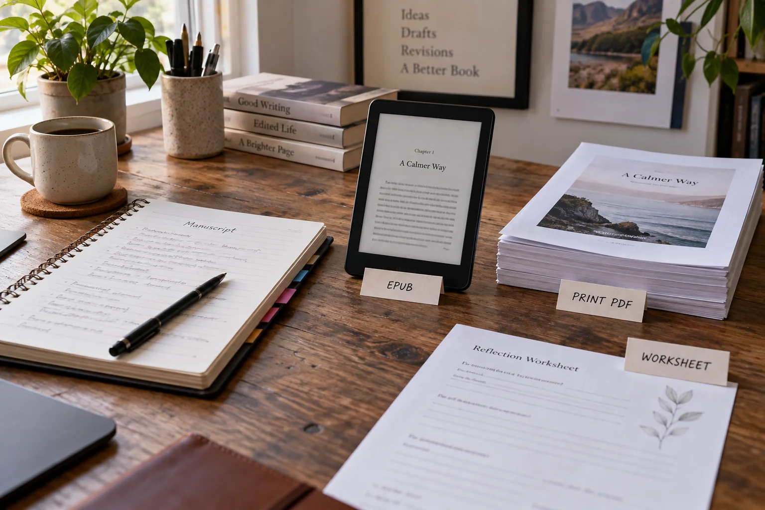
- Reflowable EPUB: reading order, text styles, navigation, and adaptable illustrations.
- Print PDF: selected trim, gutter, margins, bleed, and intentional page furniture.
- Fixed-layout EPUB: designed canvas, page composition, and platform-specific enlargement behavior.
Keep notes for print fixes and ebook fixes separately. A new paragraph or revised illustration may need checking in both, but the repair can differ. If an EPUB element overflows on a phone, changing the paperback trim size is unlikely to solve the underlying problem in the digital layout.
A practical setup for a reflowable ebook
Make one sample chapter that includes the difficult elements, then export and check it before formatting the entire manuscript. These six steps will help you catch problems while they're still easy to fix.
1. Use paragraph styles
Use named styles for chapter titles, section headings, body paragraphs, lists, quotations and captions. Then you can adjust a whole category consistently instead of fixing each occurrence by hand.
Include a long chapter title, a subheading, a list, an image, a caption and a note in the sample. After export, can you still tell the heading levels apart? Fix their styles together if not. Keep formatting and structure aligned: making a sentence bold shouldn't accidentally turn it into a navigation heading.
2. Keep the body single-column
Place sidebars and callouts at meaningful points in the main reading sequence. For true tables, Amazon recommends HTML tables rather than table images and suggests simplifying large tables in its reflowable table guidelines.
A six-column equipment table can become cramped on a phone, especially with long product names and notes. Try one entry per item, using the same fields each time. But keep a compact table when readers need to compare numbers across a row. The best repair preserves that comparison instead of scattering useful information into unrelated paragraphs.
3. Keep images inline
Insert each illustration into the reading sequence near its explanation, rather than relying on a fixed coordinate. Apple recommends inline objects for reflowable export in its Pages object-placement guidance.
Give the image useful alternative text and a caption that explains what to notice. Keep essential instructions as selectable text too. If a diagram has tiny labels, try a simpler overview with separate close-ups. Check where the image lands after export and whether its proportions survive; the editing window alone won't show you that.
4. Create navigation
Build the contents from your headings and click every entry. Include relevant back matter, and check note links as carefully as chapter links. Readers should land where the label says they will.
For example, “Materials” should take you to the start of that section, including its opening table. Follow a note link and then return to the original passage. If you've replaced “page 42” with a section link, make the link text descriptive enough that readers still understand the reference without needing a printed page.
5. Remove print-only furniture
Remove print-only running headers, page numbers, crop marks and blank left-hand pages from an ordinary reflowable ebook. Keep numbers that belong to the actual text, exercises or quotations.
Search for repeated empty paragraphs and isolated page numbers, but inspect each result before deleting it. A scene break may need a consistent ornament or separator in its place. Make chapters and smaller breaks distinct so readers can follow the structure even when their screen ends somewhere different from yours.
6. Format for readability
Use the readability formatting checklist to review paragraph rhythm, heading hierarchy, spacing, and image placement, then challenge those choices in the exported book.
Try a narrow portrait view, enlarge the text and open the longest heading. Look for clipped words, deep indents and crowded captions. If something overflows, check fixed widths or long unbroken text before shrinking the font. Then return to ordinary settings and read several sections in sequence to see whether the layout feels comfortable.
Preview across screens instead of choosing one canvas
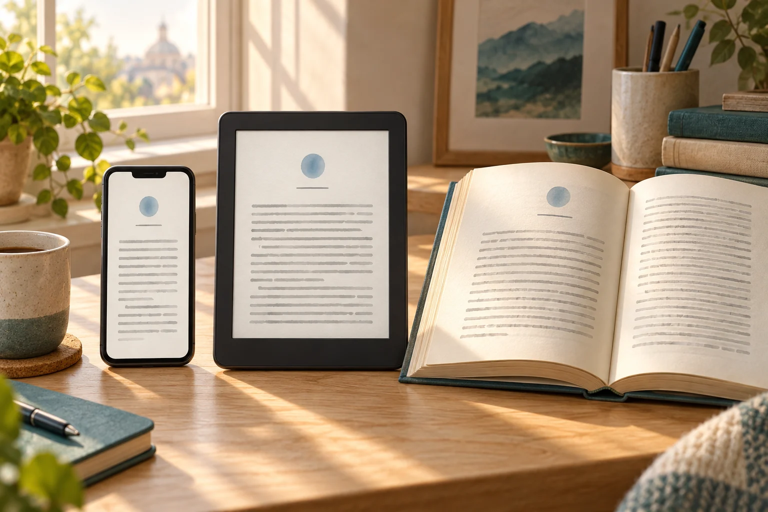
Preview the exported ebook at different device sizes and text settings instead of searching for a single canvas that suits every reader. Amazon’s Previewer documentation describes device, orientation, and font controls, plus filters for inspecting elements such as images and tables.
Work through the same checks each time you export a new version. That makes it easier to spot both a fix and any new problem it introduces:
- Phone portrait: inspect narrow tables, captions, lists, and long links.
- E-reader with enlarged text: inspect indentation, heading wraps, and missing or overlapping text.
- Tablet portrait and landscape: inspect image proportions and excessive empty space.
- Chapter boundaries: inspect the first chapter, longest title, and any scene separators.
- Difficult content: inspect the largest image, widest table, and longest paragraph.
- Navigation: follow contents entries, internal references, and notes in both directions.
For an Apple Books edition, also review the EPUB there. Apple’s Pages EPUB guidance explains which Pages features change during export, including the conversion of reflowable footnotes to endnotes. Check the result rather than assuming the source document’s note arrangement survived unchanged.
A successful ebook is complete, readable and easy to navigate across the views you checked. Matching the source document's page count isn't the goal. Save the reviewed export with its manuscript version and the reading apps you used, so you know exactly which file is ready to upload and which draft came before it.
Example: why artwork labels become too small
Shrink a 1,600-pixel-wide page to 400 pixels wide and everything becomes one-quarter of its original size. A label measuring 24 pixels in a given dimension becomes 6 pixels in that dimension. The example below shows why small lettering can look fine in full-size artwork and become difficult to read on a phone:
- Original canvas width: 1,600 pixels.
- Available viewport width: 400 pixels.
- Scale factor: 400 ÷ 1,600 = 0.25, or 25%.
- Scaled 24-pixel label dimension: 24 × 0.25 = 6 pixels.
If 24 pixels is the font-size setting, rather than a measured letter height, its scaled equivalent is 6 pixels; the visible letters may measure differently. The practical point stays the same. Looking only at the full-size artwork can hide a text-size problem that becomes obvious as soon as the whole page fits a narrow screen.
Choose the fix according to the label's job. If it doesn't need to sit on the artwork, move it into a live-text caption. Otherwise, enlarge the original lettering, simplify the image, split the content or use supported panel enlargement. Changing the nominal paper size alone won't change how much the artwork shrinks in this example.
This calculation assumes the whole canvas fits a 400-pixel width without cropping, margins or zoom. It isn't a measured Kindle result or a universal minimum font rule. Use it to spot the risk, then inspect your actual export in the reading systems you intend to support.
Make the ebook, print book and downloads work together
You can keep one manuscript while making different layout choices for each edition. For a travel guide, use flowing text with nearby photographs in the EPUB, a separate print interior and a packing sheet sized for home printing. Each version should do its job well rather than imitate the same page everywhere.
Keep the packing list inside the EPUB as ordinary text, even if you also offer a printable sheet. Readers can then use the complete checklist without opening another file. Include a map's essential explanation in the manuscript too, so that the information remains available when the visual layout changes between editions.
Write down what each change is for. An EPUB note might say, “Replace the equipment table with individual entries; keep every limitation.” A print note might flag an image that needs bleed. When print pagination changes, check the cover against the printer's requirements while leaving the reflowable ebook free to adapt to the reader's screen.
Before publishing, compare the content across outputs. Check a link destination, the explanation beside a map, the final step of a process and the complete packing list. The pages can look different, but readers should still receive the same essential information. That matters more than finding one page size that makes every format look identical.