Table of Contents
Book formatting has a way of making simple things sound complicated, doesn’t it? I’ve seen people get stuck on terms like “half title page” and immediately wonder, “Wait… what’s half about it?” If you’ve been there, you’re definitely not alone.
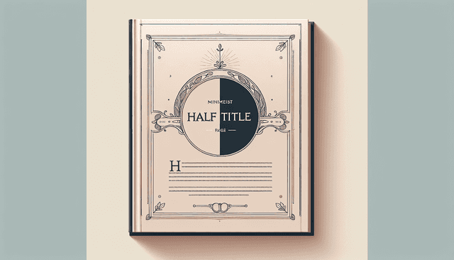
In my experience, the fastest way to feel confident is to understand what this page actually does (and what it doesn’t). So here’s the straight answer: a half title page is a minimalist page in your book’s front matter—usually showing only the book title—placed before the full title page.
Below, I’ll walk you through what it is, why publishers include it, what elements it should contain, and the most common mistakes I notice when people try to format their own books. I’ll also include a few real-world example ideas so you can picture what “good” looks like.
Key Takeaways
- A half title page is a single page that typically lists only the book’s title (no author, no publisher info), usually printed on the right-hand page.
- Its main job is to create a quiet “pause” before the full title page—building anticipation and making the title feel intentional.
- Keep it clean and simple: lots of white space around the title, centered or otherwise clearly aligned for a polished look.
- Unlike the title page, which usually includes author name and publication details, the half title page is optional and more minimalist.
- Common issues include cramped layouts, mismatched fonts, inconsistent spacing, and typos—any of which can make the page feel unprofessional.
- It’s especially common in traditional publishing, particularly for novels, academic books, and titles with longer front matter.

What is a Half Title Page?
A half title page is a page in a book’s front matter that usually contains only the title of the book—often printed on the right-hand page (the recto page) in traditional layouts.
What I like about it is the restraint. There’s no author name, no imprint, no publisher details. Just the title, set up so your reader sees it clearly before the “official” title page comes next.
Think of it like the opening beat in a song. The title hits first, and then everything else follows.
It’s not only about looks, either. It helps readers mentally “lock in” the book identity before they start scanning for other information.
Purpose of a Half Title Page
When you’re designing a book, the front matter needs rhythm. That’s where the half title page earns its keep.
In my experience, the biggest purpose is to create a moment of focus—a pause right before the full title page.
Instead of jumping straight into author/publisher details, the reader gets a clean, uncluttered title presentation. That makes the main title feel more prominent and memorable.
It also separates sections. If your book has a preface, acknowledgments, or other preliminary pages, the half title page can act like a soft divider so the book doesn’t feel like one long blur of text.
And yes—there’s a professionalism factor. Even when the content is the star, layout details like this are part of what makes books feel “finished.”
Elements of a Half Title Page
Most half title pages are pretty simple. Typically, you’ll see:
- The book title, usually centered both horizontally (and often vertically) on the page.
- Optional subtitle (some publishers include it, others don’t—there’s no single rule that applies to every book).
Here’s what I pay attention to when I’m formatting or reviewing one: spacing. You want enough breathing room around the title so it doesn’t look cramped.
Design choices matter too, but they should support the book’s vibe. For example:
- For a romance, a slightly more elegant or script-like typeface can work well—if it stays readable.
- For a thriller, bold, blocky lettering (or a clean serif) usually feels more “urgent.”
If the title is too small, the whole point is lost. And if the font doesn’t match the rest of the interior design, it can feel like the half title page belongs to a different book.
Differences Between Half Title Page and Title Page
The half title page and the title page are both early in the book, but they do different jobs.
Half title page: usually only the title (and sometimes the subtitle). It’s minimal, almost like a teaser.
Full title page: typically includes the title plus author name, and often publisher or imprint details. In many books, you’ll also see things like edition information.
So if you want a quick mental shortcut: the half title page is the setup, and the title page is the formal introduction.
One more thing: the half title page is commonly used, but it’s not always required. The title page is much more standard in traditional publishing.
Common Mistakes to Avoid
Because a half title page is simple, it’s also easy to mess up. I’ve seen it happen—usually in small ways that stand out immediately.
Here are the mistakes I’d actually try to avoid:
- Adding too much information. If you start throwing in author names, logos, or extra lines, you lose the whole point of a half title page.
- Crowding the layout. No one wants a title that feels like it’s fighting for space. Give it room.
- Using inconsistent fonts. If your body text uses one style and the half title page uses something completely different, it can look accidental.
- Choosing a title size that’s too small. Especially in print, a tiny title reads as “careless,” not “minimal.”
- Not centering correctly. Even slight misalignment can make the page feel off-balance. I always recommend checking alignment before export.
- Skipping proofreading. A typo on the title page is bad. A typo on the half title page is worse, because it’s often the first time readers see the exact title.
If you’re using a template, double-check that the font size and margins match the rest of your front matter style. Templates are helpful, but they’re not magic.
Examples of Half Title Pages
If you want ideas, looking at real books helps a lot. It’s one thing to read “minimalist title page,” and another to see how it’s done.
For classic literature, you can often spot half title pages in editions of Pride and Prejudice by Jane Austen—where the title is presented cleanly, with lots of space and a classic typographic feel.
In contemporary publishing, some editions of books like Where the Crawdads Sing by Delia Owens also use design choices that make the title feel like an event, not just a label.
One practical tip: don’t just copy the look—copy the logic. Genres tend to follow patterns. For instance:
- Romance often uses softer type choices and more elegant spacing.
- Thrillers and mysteries often lean into sharper contrasts—stronger typography, bolder weights, and cleaner layouts.
Also, some authors and designers add subtle textures or faint background elements. I think that can work—as long as it doesn’t compete with the title. If the background makes the title harder to read, it’s too much.
If you want more inspiration, browsing publishing resources can help too. You can check out automateed.com for practical publishing guidance and examples that can spark ideas for your own layout.
When to Use a Half Title Page
So when should you include a half title page? Honestly, it depends on the style of your book and how you want the reader to experience the front matter.
It’s most common in traditional publishing—especially for novels and academic works—because it helps structure the early pages in a way that feels classic and intentional.
If your book includes a longer front matter section (preface, acknowledgments, dedication, epigraphs, etc.), a half title page can act like a tidy transition. It gives the title a “breathing moment” before the more detailed title page.
I’ve also seen it used in:
- Collections of essays or academic texts (to break up sections neatly)
- Promotional books or portfolio-style publications (for a more polished, professional first impression)
- Multi-volume works (so each volume gets its own clean title presentation)
And remember: it’s optional. If your design goals are more modern/minimal and your front matter is short, you might decide it’s not necessary. Trust what fits your book’s tone.
Conclusion on Half Title Pages
A half title page may look small, but it does real work. It sets the tone, creates anticipation, and gives the title a clean, focused introduction before the full title page lays out the details.
When it’s done well, it signals care. It tells readers, “This book is thoughtfully presented.” And sometimes that first impression matters more than we admit.
If you’re formatting your own book, I’d treat the half title page like a chance to make the title feel special—simple, readable, and aligned with your overall design.
Go ahead and let the title shine.
FAQs
A Half Title Page is a page in a book that typically includes only the title of the work (and sometimes the author’s name, depending on the publisher). It comes before the full title page and gives readers a clean visual introduction without extra publication details.
The purpose is to create a simple, focused “pause” for the reader. It highlights the title and prepares people for the next page, where you usually get the full title page details like the author name and publisher/imprint information.
I’d use a Half Title Page when you want a more traditional, polished front matter structure—like in novels, academic books, or any publication where you’re building a formal reading experience. It’s especially helpful when your front matter includes multiple preliminary sections.
The big ones are overcrowding the page and breaking the minimalist intent. Keep it focused on the title, use readable font sizing, center it properly, and proofread carefully—because even a small typo on an early page can be the first thing readers notice.