Table of Contents
Manuscript formatting can feel weirdly stressful, especially when you’re just trying to get your story (or your nonfiction argument) into someone else’s hands. I get it. It’s not “writing,” it’s admin. But here’s what I noticed after formatting a few drafts for submissions: when your manuscript looks clean and consistent, it removes friction. Editors can focus on your work instead of your spacing.
In this post, I’m going to walk you through an 8-step checklist for standard book manuscript formatting—things like fonts, margins, indents, line spacing, headers, page numbers, chapter titles, and how to mark the end. I’ll also point out a couple common “gotchas” I’ve run into in Word so you don’t have to troubleshoot at the last minute.
Key Takeaways
- Use a standard 12-point font (Times New Roman, Courier New, or sometimes Arial). Don’t get cute.
- Set 1-inch margins on all sides (2.5 cm). Indent new paragraphs by 0.5 inch using Tab or your paragraph settings.
- Double-space the body text and remove extra “space before/after” so you don’t accidentally create giant gaps.
- Add page numbers and a header (usually top-right). Most submissions start numbering on page 2.
- Format chapter titles consistently and clearly (most commonly centered, bold, caps). Use Word styles so you don’t have to “eyeball” it each time.
- Mark the end of your manuscript with a simple convention (often “###” or “-30-,” depending on what your submission guidelines request).
- Always follow the publisher/agent’s specific instructions, even if they differ slightly from “industry standard.”

Use Standard Font and Size (No “Design” Choices)
When I format a manuscript for submission, I don’t start with “what looks pretty.” I start with “what will look normal to someone opening a Word doc at 11:00 p.m.” That usually means 12-point Times New Roman, Courier New, or (in some cases) Arial.
Here’s what I recommend:
- Font size: 12-point for the entire body text.
- Font: Times New Roman or Courier New are the safest bets. Arial sometimes gets accepted, but if a guideline doesn’t mention it, stick with the classics.
- Color: black text on a white background.
- Avoid: Comic Sans, Papyrus, decorative fonts, and anything that looks like it belongs on a party flyer.
One practical tip: set your font at the style level (not just by highlighting text). In Word, go to Home > Styles, click the Normal style, and make sure it’s set to your chosen font and 12-point size. That way, any new paragraphs inherit the right formatting automatically.
Set Proper Margins and Indentations (Word Setup Matters)
Most manuscript submissions ask for 1-inch margins on all sides. It’s not just tradition—those margins give editors room for notes and keep the page from looking cramped.
Do this first:
- Open your document’s Page Setup (in Word: Layout > Margins > Custom Margins).
- Set Top, Bottom, Left, and Right to 1 inch (2.5 cm).
Now the indent: new paragraphs should start with a 0.5-inch indent. In Word, don’t “fake it” with extra spaces. Use the paragraph settings (or Tab) so it stays consistent.
- Paragraph settings: Indentation > Special: First line and set it to 0.5 inch.
- Then make sure Spacing is set to 0 pt before and 0 pt after (you’ll control spacing via double-spacing, not random gaps).
Also, quick heads-up: avoid hitting Enter twice between paragraphs. If your spacing is right, you shouldn’t need that extra blank line.
If you’re trying to keep dialogue readable while still matching manuscript formatting, this is a helpful companion: how to format dialogue properly in your story.
Apply Correct Line Spacing (Double, But Clean)
Double-spacing is still the standard for book manuscripts. It gives editors enough room to mark up your pages without writing on top of your text.
In my experience, the most common formatting mistake isn’t the line spacing—it’s the extra paragraph spacing that sneaks in. Word can look “double-spaced” while also adding extra blank space before/after paragraphs. That’s when your manuscript suddenly looks… off.
Here’s the reliable way to set it:
- Press Ctrl+A (or Command+A on Mac) to highlight the entire document.
- Open Paragraph settings.
- Line spacing: choose Double.
- Spacing before/after: set both to 0 pt.
- Optional but smart: check “Don’t add space between paragraphs of the same style” if that option is available.
If you want a quick sanity check: scroll through and look for inconsistent “breathing room.” If one paragraph has a bigger gap than the next, it usually means spacing settings weren’t consistent.
Add Page Numbers and Headers (Set Up “Different First Page”)
Page numbers and headers aren’t just “nice to have.” They help editors reference specific pages quickly. And if your submission is printed or shared internally, headers reduce the “wait, which version is this?” chaos.
Here’s the common setup:
- In Word (or Scrivener), go to Insert > Page Number.
- Choose a position that matches the standard: typically Top and Right.
- Add a header via Insert > Header, then type your info—usually your last name and sometimes a title keyword.
Now the part that trips people up: many guidelines want the first page (title page) to have no header/page number, and then start numbering on page 2.
In Word, use this setting:
- Double-click the header area to open Header & Footer tools.
- Check “Different First Page”.
- Then insert your page numbers, and verify the numbering starts where the guidelines say.
What should the header look like? One common example is:
SMITH / MIDDLE GRADE MANUSCRIPT (top-right area), with the page number on the same line.
If you’re unsure, follow the exact wording in the submission instructions—some agents want last name only, some want title keywords, and some don’t want a header at all.
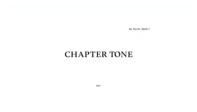
Format Chapter Titles Clearly (Use Word Styles, Not Guesswork)
Chapter titles shouldn’t blend into the text. Editors need to spot the start of a new section instantly.
There are a few “standard” conventions, and most publishers accept simple, consistent formatting. The safest approach is to keep it clean:
- Bold and capitalized (for example: CHAPTER ONE).
- Usually centered on the page.
- Keep spacing predictable—don’t let Word randomly add extra blank lines.
Here’s a concrete Word approach I use:
- Create a paragraph style called Chapter Title.
- Set Font to your manuscript font (12-point), and make it Bold.
- Set Alignment to Center.
- Set Spacing to Before: 0 pt and After: 0 pt (or whatever your guidelines specify), so you’re not stacking blank lines.
- For the “placement” on the page: many manuscripts effectively leave space so the title sits roughly a third of the way down the page when a new chapter begins.
Then apply that style every time you start a chapter.
In practical terms, if you’re using a typical submission layout (double-spaced, 1-inch margins, first-line indents), you can do this: after you finish the previous chapter’s last paragraph, insert a page break (not a bunch of manual returns), then place your chapter title and follow it immediately with the chapter text. That’s usually what guidelines are getting at—consistent structure, not a “perfect” visual measurement.
If you want to keep things simple, avoid fancy chapter formatting and stick to what your submission guidelines request. When in doubt, basic and repeatable wins.
Mark the End of Your Manuscript (Choose the Right Convention)
Ending your manuscript is emotional. I get it. But once you’re ready to submit, you need to make it obvious where the story stops.
Editors aren’t mind readers. They need a clear visual cue that the document is complete.
You’ll often see one of these centered placeholders under the final paragraph:
- ###
- -30-
Here’s the nuance: “-30-” is more commonly associated with screenwriting conventions, but you’ll still see it used in book manuscripts too. Some submission guidelines specifically request one marker over the other. If they don’t mention it, ### is a widely accepted simple option.
What about typing “THE END”?
- It’s not “wrong,” but it can look less like a submission-ready placeholder.
- If an agent’s guidelines say “use ### or -30-,” follow that exactly.
Best practice: check the submission page. If they’re silent, choose one marker and keep it consistent across your document.
Check Publisher or Agent Guidelines (Because They Really Do Vary)
This step sounds obvious, but it’s the one I see most often skipped—because people assume “standard formatting” means one universal set of rules.
It doesn’t. Some agents want double-spacing; others want a specific font. Some want the header to include a title keyword. Some want the end marker. And some want you to submit in a specific file format (PDF vs .docx, etc.).
What to do:
- Go to the publisher/agency website and find the submission guidelines page.
- Search for keywords like format, font, spacing, margins, header, page numbers, chapter titles, and end marker.
- Follow their instructions even if they differ from “industry standard.”
If you’re also figuring out your submission strategy (agented vs direct-to-publisher), these can help you keep everything aligned:
Bottom line: the “best” formatting is the one that matches what the receiving editor asked for.
Maintain Style Consistency (Make Word Do the Work)
Consistency isn’t flashy, but it’s noticeable. One random paragraph with extra spacing, one chapter title that’s slightly different, or one section where indents reset—those things pull attention away from your writing.
Here’s how I keep it under control:
- Use styles (Normal, Heading/Chapter Title, etc.) instead of manual formatting.
- Make sure Normal is your double-spaced body text with 0 pt before/after and first-line indent set to 0.5 inch.
- Use the same chapter title style every time you start a new chapter.
- Don’t mix quotation styles or spelling systems unless you intentionally chose a style (American vs British).
Quick checks I recommend before you submit:
- Run a Find search for accidental formatting patterns (for example, double spaces in the middle of sentences, or weird manual spacing).
- Scroll through and look at the start of a few chapters—if the chapter title spacing changes, your style settings probably changed somewhere.
- Check that page numbers and headers appear on all the pages they’re supposed to.
If you want an extra set of eyes, beta readers can be helpful for spotting formatting oddities that you’ll miss after staring at the same doc for hours. If you’re curious, here’s a resource: how to become a beta reader.
Consistency is what makes your manuscript feel “ready,” not just “finished.”
FAQs
Most submissions expect 12-point Times New Roman or Courier New. Some guidelines allow Arial, but if the instructions don’t mention it, stick to Times New Roman or Courier New. Keep font color black and background white.
Typically, use 1-inch margins on all sides. For paragraph indentation, most manuscripts use a 0.5-inch first-line indent (set it in Word under Paragraph > Indentation > Special: First line). Avoid adding extra spaces manually to create indents.
Double spacing is the standard. Also check that Spacing before and Spacing after are set to 0 pt so you don’t accidentally create uneven gaps between paragraphs.
Usually, yes. Most submissions place page numbers in the top-right corner and include a simple header (often your last name and/or a title keyword). Many guidelines say to leave headers/page numbers off the first page and start on page 2—in Word, turn on Different First Page to do that correctly.
Mini checklist: after you insert them, flip through your document and confirm the header/page number shows up exactly where it should on every page.