Table of Contents
Hey, I get it—typo mistakes in typography can make your designs look unprofessional and hard to read. If you’ve ever been frustrated by mismatched fonts or messy spacing, you’re not alone. Luckily, if you stick around, you’ll discover simple tips to avoid common mistakes and make your text look sharp and clean.
Keep reading, and you’ll learn how to choose the right fonts, create clear visual hierarchy, and tweak details like spacing and alignment. These easy tricks will help your text stand out without fuss or confusion.
Let’s get into the basics so your typography looks polished and inviting from start to finish.
Key Takeaways
Key Takeaways
- Limit your fonts to 2-3 to keep your design clean and avoid confusion. Too many fonts make your content look cluttered.
- Pair fonts that contrast well, like serif with sans-serif, to make your text visually appealing and clear.
- Create a strong visual hierarchy using different font sizes and weights so readers understand what’s most important.
- Align text left for easier reading; centered or justified can be stylish but may reduce readability on some screens.
- Adjust space between letters and lines to prevent text from feeling crowded or too loose, making it easier to follow.
- Use high contrast between text and background—dark on light or vice versa—to ensure your text is legible at a glance.
- Choose fonts that support multiple languages and formats to keep your content versatile and ready for future growth.
- Avoid widows, orphans, and rivers by fixing text flow issues, which helps keep your content tidy and easy to read.
- Maintain consistency in bullets, lists, and callouts to make your content look organized and professional.
Avoiding common typography mistakes can make a huge difference in how your content is perceived and how easy it is to read. Here’s a quick, straightforward guide to help you spot and fix these issues before they turn readers away.
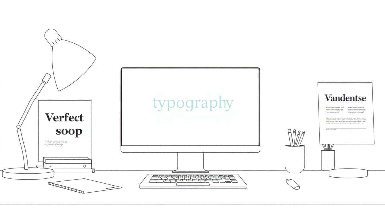
1. Limit the Number of Fonts Used
Using too many fonts on one page creates chaos and distracts readers. Sticking to 2-3 fonts keeps your design clean and professional. For example, you might use one for headings and another for body text, but avoid a new font for every section. Research shows that poor typography, including excessive fonts, causes 38% of people to stop engaging with a website [source](https://automateed.com/why-is-grammarly-so-expensive-an-in-depth-analysis/).
2. Pair Fonts Carefully
When choosing fonts to go together, contrast is key. Pair a serif font (like Times New Roman) with a sans-serif (like Arial) for clarity and visual interest. Make sure the fonts complement each other and don’t clash. If you’re stuck, look for font combinations recommended by experts, such as those on [best fonts for book covers](https://automateed.com/best-fonts-for-book-covers/).
3. Create Clear Hierarchy
Guide readers through your content with typographic hierarchy. Use larger, bolder fonts for headings, slightly smaller for subheadings, and a comfortable size for paragraph text. This helps prevent confusion and keeps the page organized. When hierarchy is clear, readers know what to read first and what’s most important.
4. Use Proper Text Alignment for Readability
Left-aligned text is easiest to read, especially for longer content. Centered or justified text can look elegant but might cause uneven spacing, making it harder to follow. Consistent alignment creates a neat, professional look and improves readability across devices.
5. Adjust Letter Spacing (Kerning and Tracking)
Too close or too far apart, letters can hamper reading. Adjust kerning (space between specific letter pairs) to fix awkward gaps, and set appropriate tracking (overall space between letters) to improve flow. For example, increasing tracking slightly in headlines can make text stand out without looking crowded.
6. Set Appropriate Line Spacing (Leading)
On crowded pages, lines that are too close together make reading tiring. Conversely, too much space breaks the flow. A good rule of thumb is setting line spacing (leading) at around 1.2 to 1.5 times the font size. This provides enough breathing room without losing connection between lines. Proper spacing is especially crucial for mobile screens, where readability drops quickly if lines are too tight.
Mastering these fundamentals can drastically improve your content’s appearance and clarity. Remember, good typography isn’t just about aesthetics—it’s about making your message easy to consume. Keep your font choices simple, contrast them wisely, and establish a clear structure, so your audience sticks around longer.

7. Ensure High Contrast Between Text and Background
Having good contrast is key to making sure your text is easy to read. Light grey text on a white background is a common mistake, as it strains the eyes. Aim for black or dark-colored text on light backgrounds, or vice versa, to maximize readability. A quick tip is to use online tools like [WebAIM Contrast Checker](https://webaim.org/resources/contrastchecker/) to verify your color choices. Remember, 38% of people will stop engaging if your content layout isn’t attractive, and poor contrast plays a major role in that (Adobe, 2023). If you’re designing for mobile, test your contrast on different screens to catch any issues.
8. Choose Fonts That Support Multiple Languages and Future Needs
Anticipate the future by picking fonts that support different languages, special characters, and varied scripts. For example, if you plan to expand your reader base globally, opt for fonts like **Roboto** or **Noto Sans**, which support numerous languages, making your content more inclusive. Also, consider the longevity of the font—will it look good in different formats or sizes later on? This prevents you from needing to switch fonts down the line, saving time and maintaining consistency. For more tips, check out [best fonts for book covers](https://automateed.com/best-fonts-for-book-covers/).
9. Avoid Widows, Orphans, and Rivers in Text
Widows, orphans, and rivers are common typographic issues that distract and frustrate readers. A widow is a single word at the end of a paragraph, an orphan is a single line at the beginning of a new page or column, and rivers are large gaps that run through justified text. To avoid this, tweak your paragraph settings, hyphenation, and spacing. For example, adjusting your line breaks manually or using software features can help keep the flow smooth. Remember, clean text layout keeps your readers engaged and improves overall readability.
10. Use Consistent Style for Bullet Points, Lists, and Callouts
Using a consistent style for lists, bullet points, and callouts helps your content look organized and professional. Decide whether you’re using circles, squares, or dashes, and stick with that choice throughout your document. Also, keep the indentation and spacing uniform to avoid a cluttered appearance. Consistency in style guides your readers’ eyes and ensures they easily understand and remember the key points. For example, if you’re highlighting tips for writers, consistent formatting makes your advice clearer and more memorable.
FAQs
Using too many fonts can make your design look cluttered and confusing. Limiting fonts creates a cleaner look and helps maintain visual harmony, ensuring your message is clear and easy to read.
Select fonts that complement each other in style, weight, and mood. Aim for contrast with clear differences but maintain harmony for a professional and cohesive look.
Create clear hierarchy with font size and weight, align text properly, and use adequate line spacing. High contrast between text and background also aids readability.
Proper alignment improves the structure and flow of your text, making it easier for readers to scan and understand your content. Consistent alignment enhances overall visual consistency.