Table of Contents
Creating professional book interiors can feel overwhelming, especially if you’re new to design or layout work. But don’t worry—by following a few simple steps, you can craft beautiful, reader-friendly pages that make your book stand out. If you keep reading, I’ll guide you through essential tips to help you create polished and consistent interiors.
In this quick overview, we’ll cover how to choose the right size, pick clear fonts, organize your pages well, and ensure everything looks great before printing. Stick with me, and you’ll have your book’s inside looking as good as the story you want to tell.
Key Takeaways
Key Takeaways
- Start with a common, professional size like 6×9 inches and use a grid layout to keep margins even and pages clear. This makes your book look neat and you easier to read.
- Choose simple, clear fonts like Times New Roman, Georgia, Arial, or Helvetica. Use 11-12 point size for text and keep fonts consistent for a unified look.
- Use standard margins of around 0.75 to 1 inch all around and set line spacing between 1.15 and 1.5. Proper space gives your interior a polished and comfortable feel.
- Break up your text into short paragraphs of 3-4 sentences and use line breaks to mark new sections. This helps readers follow your ideas easily.
- Add small design touches like drop caps or simple dividers. Use lists and images thoughtfully to make your interior attractive without distracting from the text.
- Keep line lengths between 45-75 characters. Adjust layout settings to find the right balance, making your pages easy to scan and read.
- Follow a style guide for fonts, headings, and spacing. Consistency makes your book look professional and saves time during editing.
- Proofread your finished interior on screen and in print. Double-check for spacing, font consistency, and any errors to ensure a high-quality final product.
- The book interior industry is growing, and a well-designed layout can help your book stand out. Stay updated on design trends to improve your look.
- If unsure about your design skills, hiring a professional can greatly enhance your interior, ensuring it looks polished and matches your content’s quality.

Choose the Right Trim Size and Layout
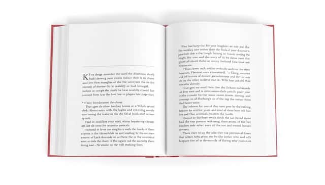
Starting with the right trim size is key to making your book look professional and inviting. Common sizes like 6×9 inches work well for most genres, but choose what fits your audience and content best. Once you’ve got that nailed, set up a layout that balances white space with text—think of it as giving your content room to breathe.
Use a clean, grid-based layout to keep margins consistent and avoid clutter. A straightforward layout helps your book feel polished and makes reading easier. If you’re using design tools like Amazon KDP or professional formatting software, they often have templates for standard sizes and layouts that save you a headache.
Use Clear and Readable Fonts
Pick fonts that are easy on the eyes—serif fonts like Times New Roman or Georgia work great for printed books, while sans-serif options like Arial or Helvetica are good for headings or digital formats. Avoid fancy scripts or overly decorative fonts—they can be hard to read, especially at smaller sizes.
Stick to a font size around 11-12 points for body text and larger sizes for chapter titles. Use consistent font styles throughout the book to give it a cohesive look. For added professionalism, consider pairing a serif font for text with a sans-serif font for headings to create visual hierarchy.
Set Consistent Margins and Spacing
Margins are your book’s breathing room. Standard margins are typically 0.75 to 1 inch on all sides, but make sure they’re uniform across the document. Proper margins prevent text from running too close to the edges, which can look sloppy and cause printing issues.
Line spacing also matters—1.15 to 1.5 line spacing makes reading comfortable and avoids a crowded feel. Consistent spacing between paragraphs and section breaks adds to a clean, professional style. Think of it as giving your readers enough space to relax with your words—no squeezing allowed!
11. Select Appropriate Line Breaks and Paragraphs
Breaking your text into shorter paragraphs makes it easier to read, especially on mobile devices. Aim for 3-4 sentences per paragraph to keep things digestible. Use line breaks to highlight key points or sections, which guides the reader’s eye naturally across your content. For instance, when transitioning between topics or examples, a fresh paragraph helps signal a new idea and keeps your book’s interior clean and well-structured.
12. Incorporate Visual Elements and Design Features
Adding simple design elements like drop caps at the start of chapters or subtle dividers can make your interior more appealing. Use bullet points or numbered lists to organize information clearly. Remember, visual consistency—like uniform headings, subheadings, and spacing—keeps your interior professional. If your genre benefits from illustrations or images, ensure they’re placed thoughtfully without disrupting the flow of the text, keeping your interior both attractive and easy to navigate.
13. Adjust Line Lengths for Better Readability
Optimal line length is usually between 45-75 characters per line. Longer lines can strain the eyes, while too short lines break the flow. Use your layout software to tweak line widths or characters per line, creating a comfortable reading rhythm. For example, on a 6×9 inch layout, adjusting margins and font size can help you hit this sweet spot—making your book feel cozy rather than cramped.
14. Use and Consistently Apply Style Guides
Stick to a style guide to keep fonts, headers, spacing, and other formatting consistent throughout your book. This not only makes your interior look polished but also saves time during editing and proofing. You can create your own simple style sheet or follow common standards—like those from the best fonts for book covers—to ensure everything matches perfectly from chapter to chapter.
15. Conduct Final Checks with Readability in Mind
Before printing, read through your interior in its final form, preferably on a device and in print. Check for any awkward line breaks, inconsistent fonts, or spacing issues. Use tools or ask others to proof—fresh eyes catch mistakes you might overlook. Remember, a well-proofed interior boosts your book’s professionalism and makes your readers’ experience more enjoyable.
16. Keep Up with Industry Trends and Statistics
The interior design world is booming, with the global interior design services market valued at over $82 billion in 2024. This growth reflects more attention to aesthetics and detail, which applies directly to book interiors. As the industry expands and interior design jobs grow at 13% over the next decade, investing in a professional, cohesive interior layout can set your book apart and meet rising standards of quality.
17. Know When to Seek Professional Help
If you’re unsure about your layout skills or want a truly polished look, bringing in a professional designer or formatter can make a big difference. They understand industry best practices and trends, ensuring your interior matches the quality of your content. Professional assistance is especially helpful for complex projects or when aiming for high-end publishing, helping you avoid common pitfalls and ensuring your book looks its best.
FAQs
Consider your book’s genre, target audience, and printing costs when selecting a trim size. A standard size can appeal broadly, but unique sizes may help your book stand out. Match the size to your content and design goals.
Use clear, easy-to-read fonts such as serif fonts like Times New Roman or Georgia for body text. Avoid overly decorative fonts and ensure sufficient size and spacing for comfortable reading, generally around 10-12 points.
Consistent margins and spacing create a clean, professional look and improve readability. They help organize content clearly, making pages visually appealing and easier for readers to navigate without distraction.
Arrange front matter (title page, copyright, acknowledgments) at the beginning and back matter (glossary, index, resources) at the end. Proper organization helps readers find information easily and enhances the overall flow of your book.