Table of Contents
Have you ever tried to calculate book spine dimensions and felt like you were juggling spreadsheets, printer specs, and a ruler all at the same time? Yeah, same. The good news is: once you know what your printer is assuming (paper thickness and/or PPI), the spine width math is pretty manageable.
In my experience, the biggest “gotchas” aren’t the formulas themselves—they’re the assumptions hidden inside them. So I’m going to show you a couple of real-world ways to calculate spine width, explain what the numbers mean, and give you a few worked examples you can actually sanity-check against a template.
By the end, you’ll know exactly how to figure out the right spine size for your book cover (and what to do when the template doesn’t match your calculation).
Key Takeaways
- Spine width comes from your page count plus the physical thickness of the interior pages (often expressed as PPI), and for hardcover you add board thickness on both sides.
- Bleed and safe margins are about the trim line—not the “finished” edge you’re designing to. A common starting point is ~3 mm bleed and ~5 mm safe margin, but always follow your printer’s template.
- Use the printer’s specs when you can. If you don’t have them, you can estimate temporarily—but you should verify using a template or test proof.
- Templates (KDP, IngramSpark, local printers) may conflict with your calculated spine because of different rounding rules and bleed/cover-wrap assumptions.
- Before you upload, do a quick mismatch check: if your spine width is off by 1–2 mm, you usually need to adjust paper thickness/rounding—not just “eyeball” the cover.

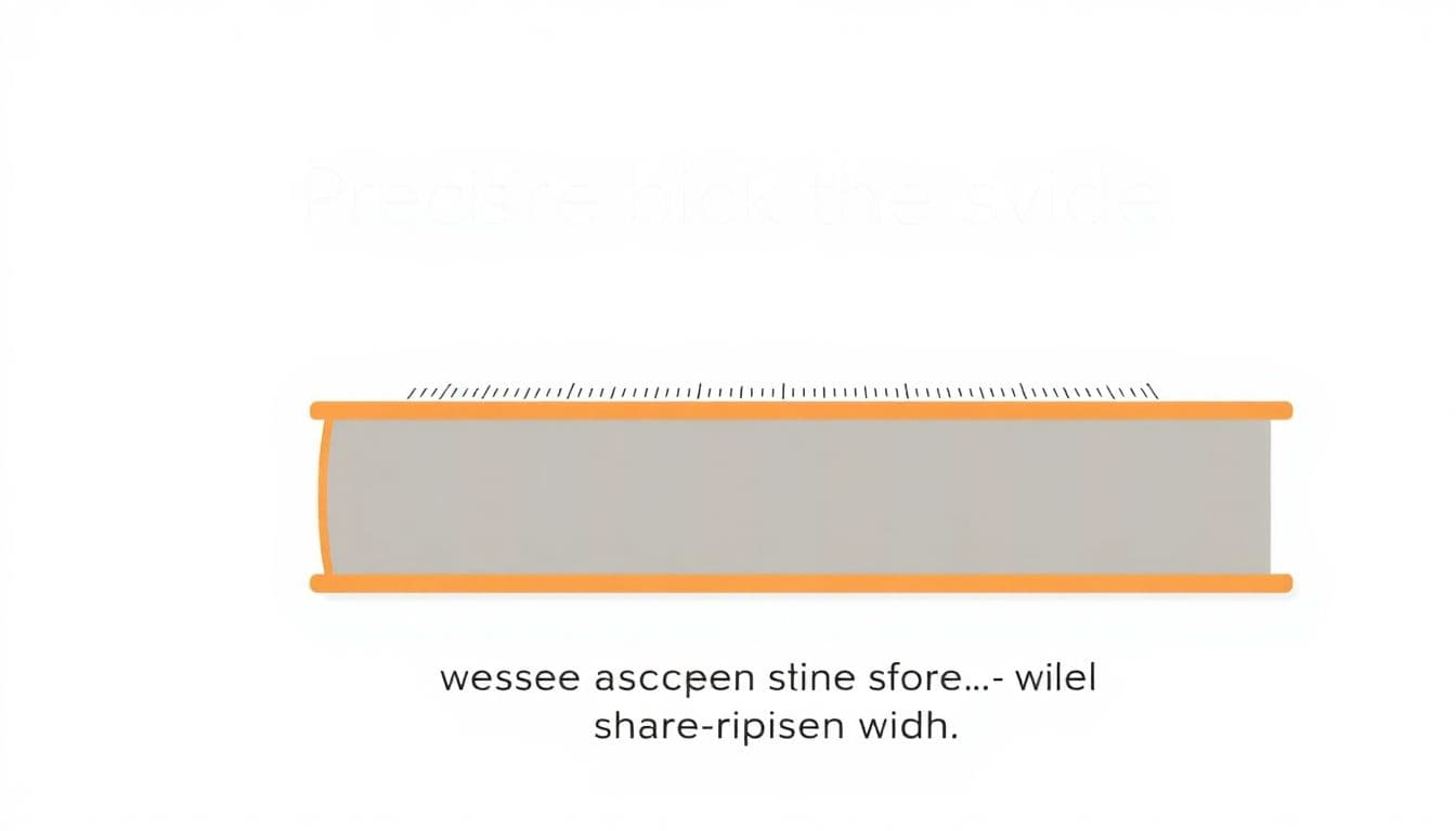
Let’s get practical. The core job is to figure out spine width (the thickness of your book’s “block” of pages and, for hardcover, the boards). Once you have that, your cover wrap becomes straightforward.
11. How to Adjust Your Book Cover Size for Different Formats
Book cover sizes aren’t one-size-fits-all. They vary based on the format (paperback vs hardcover vs eBook) and the retailer/printer you’re using.
Here’s what I do first: I check the platform’s cover size rules and template, then build my spine width into that system. Why? Because templates bake in assumptions like bleed, rounding, and cover wrap behavior.
For example, many print workflows treat the “finished spine width” slightly differently than the “total cover width” you design to. Some platforms effectively add a small bleed allowance to match their finishing process (you’ll see different numbers depending on where you upload).
If you’re designing for digital (eBook) covers, the spine width doesn’t exist in the same way. You’re dealing with a single front cover image displayed on screens. So don’t overthink spine math for eBooks—focus on the platform’s pixel requirements instead.
If you want a quick starting point for common print sizes, 6 x 9 inches is a popular trade paperback format, and 5.5 x 8.5 inches is common for smaller trims. But again—use your printer’s size chart, not guesswork.
When you’re ready to convert your cover measurements into pixels, a dedicated tool can help. You can use this book cover size pixels calculator to avoid blurry uploads and mis-sized files.
12. How to Include Bleed and Margins in Your Cover Design
Bleed and safe margins are where most “my cover got cut weird” problems come from. The spine math can be perfect, but if your artwork doesn’t respect the trim line, you’ll still end up with missing title text or uneven backgrounds.
Bleed is extra artwork that extends beyond the trim line—commonly about 3 mm (or ~0.125 inches). This compensates for small shifts during cutting.
Safe margin (aka the safe zone) is the area where important text and logos should live. A common starting point is 5 mm (~0.197 inches) inward from the trim line.
What I noticed the hard way: it’s easy to design the spine title right on the edge of the spine panel in your template. Then trimming happens. Suddenly the title is “almost” centered… and readers can’t unsee it.
How bleed/safe zones map to the spine:
- For the spine area, your design should include the bleed extension so the background color/texture doesn’t show a gap after trimming.
- Your spine text should sit within the safe zone, not the bleed boundary. On narrow spines, even a 1–2 mm shift can noticeably change readability.
- If your template provides separate spine text guides, follow them. If it doesn’t, you can create your own safe guide: move your spine text inward by at least 5 mm from the trim edge.
Most printers provide templates that already include bleed and safe zones. If you have that option, use it. If you’re building from scratch in Canva/Photoshop/GIMP, set up your document with bleed lines and keep text well inside the safe margins.
13. Recommended Tools and Software for Calculating and Creating Book Covers
I’m not going to pretend you need fancy software to get this right, but the right tools absolutely reduce mistakes.
Here are the ones I see work well in real workflows:
- Adobe Photoshop alternatives and Photoshop itself for precise measurement and export control.
- Canva when you’re comfortable working with templates and guides.
- GIMP if you prefer free tools and want full control over file export.
For spine-specific sizing, I like using calculators because they’re consistent about rounding. If you want a spine/cover measurement helper, this cover size pixels calculator can help you translate your physical dimensions into print-ready pixel sizes.
Also, don’t ignore platform templates. If you’re uploading to KDP or IngramSpark, their templates are basically “the truth” for layout. You can still calculate spine width first, but your final cover should match the template’s spine panel width.
When exporting, aim for print-friendly formats (often PDF/X-1a or TIFF, depending on the printer). And keep resolution in mind—300 DPI is the usual baseline for crisp results.
14. Choosing the Right Font and Color Palette for Your Book Cover
Spine space is tight. That’s why the font choice matters more on the spine than it does on the front cover.
In my experience, a readable spine usually means:
- One clear font style (or a simple pairing). Too many typefaces can look messy when the spine is narrow.
- High contrast between text and background. If your spine title is dark gray on black, it’ll disappear in real-world lighting.
- Simple letterforms. Serif fonts like Georgia or Times can look great, but thin strokes can get lost when the spine is very slim.
For genre vibes, sure—romance often leans toward softer palettes and elegant scripts, and thrillers/horror can go bold with strong reds and blacks. Just don’t sacrifice readability for aesthetics.
If you’re using web fonts, Google Fonts is a decent place to find alternatives you can test quickly.
One practical tip: preview your cover in grayscale. If the title still pops without color, it’s usually safe for print.
15. Final Checks and Tips Before Submitting Your Book for Printing
Before you hit submit, I run a quick checklist. It takes a few minutes and saves hours of “why did this happen?”
- Match the platform/template: your cover canvas dimensions (including spine width) should match the required template.
- Verify bleed and safe zones: the background should reach the bleed edge; text should sit inside safe margins.
- Check resolution: aim for 300 DPI for raster artwork. Vector text should export cleanly.
- Read the text like a buyer: does the title and author name still read at a glance when viewed small?
- Do a quick “spine sanity check”: if you calculated spine width and the template shows a different spine panel width, don’t ignore it—adjust based on the template (or revisit your paper thickness assumptions).
- Export correctly: use the format the printer asks for and confirm the PDF doesn’t downsample images.
If you can, do a test print at a local shop (or print a proof on your own printer). Seeing the spine in physical form is the fastest way to catch issues like overly thin fonts or artwork that doesn’t wrap the way you expected.
FAQs
Measure the book’s spine height from the top edge to the bottom edge. If you have the physical book, a ruler works, but a caliper is even better for accuracy. This spine height should match your trim size (the book’s finished height), not the full cover canvas size.
Use your manuscript or print layout file to find the total interior pages. Word processors sometimes show “pages” differently depending on formatting, so I usually cross-check with the print settings (trim size, margins, and layout) or with a page count report from the tool I’m using to format the book.
It depends on the look and feel you want. Coated paper tends to feel smoother and often looks sharper for color interiors, while uncoated can be easier on the eyes and can feel more “classic.” Just remember: thicker paper increases spine width, so your paper choice directly affects the spine calculation.
You’ve got two common approaches:
- PPI method: Spine width (in inches) = (number of pages) ÷ (paper PPI). The PPI value should come from your printer’s paper spec sheet.
- Rule-of-thumb formula: Spine width = (interior pages ÷ 444) + 0.06. This is an approximation based on typical paper stock assumptions.
My advice? If your printer provides PPI or paper thickness, use that. If you don’t, the 444 + 0.06 formula can get you close, but you should verify against the platform template before final export.
In this context, PPI means pages per inch—basically how many interior pages fit into one inch of page block thickness for a specific paper type. Higher PPI usually means thinner paper (more pages per inch), and lower PPI means thicker paper.
If you don’t know your printer’s PPI, check the paper options page or spec sheet. If you can’t find it, use a temporary estimate, but expect the spine width to shift when you compare against the template.
This happens more than people admit. Usually it’s one of these:
- Different paper thickness assumptions (PPI mismatch).
- Rounding: printers round spine width to the nearest increment.
- Different definition of “pages”: some systems count interior leaves differently.
- Hardcover boards included/excluded depending on the workflow.
If your spine width is off by 1–2 mm, I’d adjust your paper thickness/PPI assumption first, then re-check against the template. If the template is available, it’s usually best to align your final cover to the template’s spine panel width.
Rounded spines and layflat bindings change how the cover wraps, so the spine panel in a template may not behave exactly like a straight spine. What I do is: follow the printer’s binding notes and use their template if they provide one for that binding style. If you’re designing without a template, keep spine text slightly more centered and avoid placing critical text too close to the edges.
Don’t panic. Templates often reflect the exact production method they use (including how they round and what they consider “finished” vs “bleed” widths). If you can, use the template’s spine width for your final design, then update your calculation inputs for next time.
If you’re testing, do it in this order: calculate → compare to template → adjust inputs → re-calculate. That way you’ll learn which assumption was different.

Quick reference: if you want a deeper dive on paper choices and how thickness affects your cover, check out this resource. It’s the part most people skip—until they have a spine mismatch.
And if you’re still stuck, that’s normal. Spine dimensions are one of those “small numbers with big consequences” parts of book design. The fix is usually simple once you pin down your printer’s specs and match the template.