Creating layouts that are easy for readers to follow isn’t just about looks—it keeps them engaged and makes your message clearer. If your content looks cluttered or confusing, visitors might bounce before truly seeing what you have to say. Luckily, there are simple ways to make your pages more user-friendly and inviting, and I’ll show you how to do that easily. Keep reading, and you’ll learn practical tips to create layouts that are both attractive and comfortable for your audience.
Key Takeaways
- Use a grid to organize your content, making it easier to scan and understand.
- Highlight important parts like headings and calls to action with size, boldness, or color for clarity.
- Keep design elements consistent—same fonts, colors, and spacing—to look professional and familiar.
- Place key messages and visuals above the fold to grab attention immediately.
- Make contact info and navigation menus easy to find, using sticky headers if possible.
- Add relevant visuals like images and icons to support your message and make content more engaging.
- Balance your layout with symmetry and proper spacing to create a clean, trustworthy look.
- Include clear, standout CTA buttons, and arrange navigation logically to guide users smoothly.
- Choose easy-to-read fonts in appropriate sizes, and keep font styles consistent across your site.
- Break content into smaller chunks using headings and lists to make info quick to scan.
- Add visual cues like colored text or icons to help readers find key points fast.
- Ensure your website works well on all devices by making it responsive and accessible.
- Regularly review your layouts on different screens and ask for user feedback to improve usability.

Create Clear and Consistent Layouts
Designing layouts that are easy to follow begins with using a grid system. Grids help organize content neatly, making it easier for readers to scan and understand your message quickly. For example, aligning text and images within a grid creates a balanced look that guides the eye naturally across your page.
Maintaining a visual hierarchy is also key. Highlight the most important elements—like headings or calls to action—by making them larger, bold, or using contrasting colors. This helps readers identify what to focus on first and navigate your content effortlessly.
Stick to a consistent style for headings, buttons, and other design elements. Consistency in fonts, colors, and spacing not only looks professional but also builds familiarity, so users know what to expect as they browse your layout.

Prioritize Key Content in the Above-the-Fold Area
Since 57% of visitors spend their time above the fold, make sure your most important messages and visuals are placed right at the top of the page.
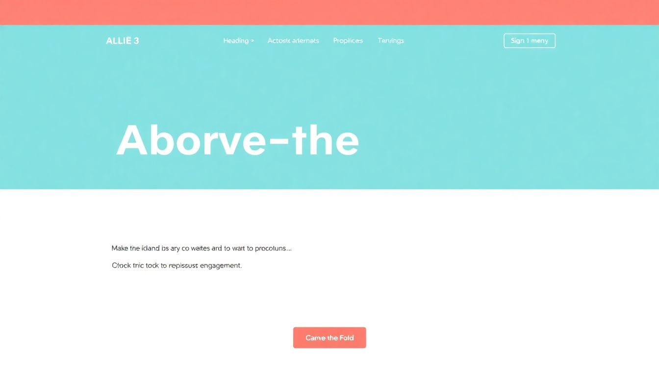
This means placing your headline, main call-to-action, and eye-catching images where they can be seen immediately without scrolling.
By doing so, you grab attention early and guide users to the next steps effortlessly.
Place Essential Contact and Navigation Elements Prominently
Almost 44% of visitors leave if contact info isn’t easy to find, so ensure your contact details are visible on every page.
Clear, well-organized navigation menus also help visitors find what they’re looking for without confusion.
Try using sticky headers that stay visible as users scroll, helping them access key links anytime they need.
Incorporate Visuals That Support Your Message
Since nearly 90% of information transfer happens through visuals, add relevant images, icons, and infographics to break up text and engage readers.
Visuals can convey complex ideas quickly, making your content more digestible and memorable.
For example, using icons next to menu items or visuals illustrating steps can improve overall comprehension.
Focus on Layout Balance and Symmetry
92.6% of people say design influences purchase decisions, so create a clean and balanced layout that’s easy on the eyes.
A symmetrical design with consistent spacing and alignments makes your site look professional and trustworthy.
Don’t overcrowd; use grids and columns to systematically organize elements and avoid clutter.
Use Eye-Catching Call to Action (CTA) Buttons
70% of small business websites lack a CTA, which is a missed opportunity to guide visitors.
Make your CTAs stand out with contrasting colors and clear, action-oriented text—like “Get Started” or “Download Now.”
Position these buttons where they’ll be seen naturally, such as after a compelling value proposition.
Maintain Clear Navigation Structure
38% of visitors check navigation or layout upon arrival, so structure your menus with logical categories and simple labels.
Using familiar terms helps users understand where they are and where they can go next, reducing frustration.
Implement dropdowns or mega menus sparingly to avoid overwhelming visitors.
Choose Fonts That Are Easy to Read and Consistent
Since only 18% focus on font style, picking clear, legible fonts like Arial, Helvetica, or Georgia can boost readability.
Stick to one or two font styles throughout the site to create a cohesive look and prevent visual chaos.
For digital content, avoid decorative fonts for body text; instead, reserve those for headings or accents.
Set Optimal Font Sizes and Spacing
Use sufficient font sizes—generally 16px or larger for body text—to accommodate different screens and age groups.
Ensure line spacing (leading) allows easy reading, typically around 1.5x the font size.
Adjust spacing to prevent text blocks from appearing cramped, which can deter scanning.
Align Text for Best Readability and Flow
Left-aligned text provides the most natural reading flow for most languages, making it easier to scan content.
Maintain consistent margins across pages to create a unified and organized appearance.
This approach reduces eye movement and keeps users engaged with your content.
Break Content into Manageable Chunks and Use Lists
Digital readers prefer content organized with headings, subheadings, and bullet lists, as it simplifies information consumption.
Use clear headings and numbered lists to highlight steps or key points, making content skimmable.
Employ bold or italics sparingly to emphasize important words or phrases without cluttering the page.
Make Content Scannable with Visual Cues
Using highlights, icons, or colored text helps guide the eye through your content effectively.
This is especially useful in longer articles or instructions where users want to find specific info quickly.
Design for Accessibility and Responsiveness
Ensure your site is resize-friendly so users can adjust text size without breaking layout—an essential for 70% of users with visual impairments.
Avoid narrow columns that cause line breaks or horizontal scrolling, which can frustrate visitors on mobile devices.
Use semantic markup such as headings and ARIA labels to help screen readers better interpret your content.
Test and Tweak Layouts Regularly
Check how your pages look with bigger text sizes; in many cases, this reveals hidden clutter or broken elements.
Verify your site across different devices and browsers to ensure consistent appearance and functionality.
Gather feedback from real users to identify pain points and refine your layout accordingly.
FAQs
A grid system helps organize content neatly, making layouts more balanced and easier to follow. It provides a clear structure that guides the placement of elements, leading to consistent and professional-looking designs.
Whitespace creates space around content, reducing clutter and making it easier to focus. It guides the reader’s eye, helps separate sections, and improves overall clarity of the design.
Select easy-to-read fonts, set appropriate sizes and spacing, and avoid overusing styles like all caps or underlines. Clear typography ensures content is legible and visually appealing across devices.
Regularly testing layouts ensures they remain clear and usable across devices and screen sizes. It helps catch issues early, allowing adjustments that improve user experience and maintain consistency.
