It is or anyone crucial for anyone stepping into the world of publishing to understanding what does a manuscript look like. This is the first step in transforming your raw literary creation into a published masterpiece.
Proper formatting, while seemingly a minor detail, can significantly impact how agents, editors, and publishers view your work. It’s about making a strong first impression that signals your commitment to quality and professionalism.
As we dive deeper into the specifics of manuscript formatting, remember that these guidelines are designed to make your work accessible and engaging to those who can bring it to the broader public. A well-prepared manuscript paves the way for your words to be taken seriously in the world of publishing.
What Does a Manuscript Look Like?
Think of a manuscript as your story dressed up in its best outfit, ready to make a good first impression.
It’s all about getting the look right, from the font you use to how you space out the words on the page. Even though what you’ve written is the most important part, the way you present it really matters too.
A typical manuscript has clean, easy-to-read text, usually typed out in a plain font like Times New Roman, size 12. This isn’t just about making it look nice; it’s about making sure anyone who reads it, like a publisher or an editor, can do so easily.
Imagine double-spaced lines (so there’s space between each line of text), with margins that are about an inch all around the page. This isn’t just for looks—it helps people write notes and comments about your story.
Also, your manuscript should start each chapter on a new page and use page numbers so nothing gets lost. It’s kind of like making sure your story is wearing its best formal clothes, showing respect to those who’ll read it, and helping your words get the attention they deserve.
Tips for Creating a Good Manuscript

1. Choose the Right Font and Size
When you’re getting your manuscript ready, picking the right font and size is a bit like choosing the perfect outfit for a job interview. You want it to look sharp, professional, and easy on the eyes.
Going with a standard font like Times New Roman, size 12, is your best bet. It’s the classic —always in style and makes a good impression.
Using a font like Times New Roman in size 12 helps everyone who reads your manuscript, from editors to agents, to do so without squinting or getting distracted by fancy letters.
It’s all about making your words easy to read. This isn’t just a random rule; it’s about making sure your story gets the attention it deserves without any hurdles.
By sticking to these standards, you’re showing that you’re serious about your work and you respect the norms of the publishing world.
Plus, it makes your manuscript look clean and organized, which is always a good thing.
2. Set Proper Margins and Spacing
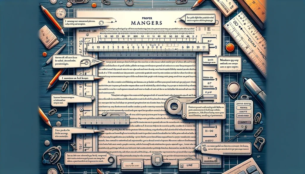
Setting up the right margins is like making it as easy as possible for your readers to step into your story.
The unwritten rule here is to go with 1-inch margins all around your page and to keep your lines double-spaced. This isn’t just about making things look neat; it’s about practicality and courtesy.
The 1-inch margins give your words a bit of breathing room on the page. It’s like not sitting too close to someone on a bus; everyone appreciates a little personal space.
For editors and agents who’ll be reading your manuscript, these margins are the perfect spot to jot down notes, questions, or suggestions. It’s like leaving room in the margins of a textbook for your own thoughts.
Double-spacing is another way to make your manuscript more reader-friendly. It’s easier on the eyes, which is a big deal when someone is going through page after page of your work.
Plus, it leaves plenty of room for comments right between the lines.
Together, these formatting choices create a manuscript that looks professional and considers the reader’s experience.
It’s like saying, “I value your time and your thoughts on my work.” That’s a powerful message to send before anyone even reads a word of your story.
3. Include Header Information
Header on each page of your manuscript is like a little bit of info at the top of every page that includes your name, the title of your work, and the page number.
Putting your name up there lets everyone know who the story belongs to, kind of like putting your name on your lunchbox so it doesn’t get mixed up with anyone else’s.
The title of your work helps keep all the pages together. And the page number? Well, that serves like a guide so one can easily find their way in your story.
This simple step keeps your manuscript organized and easy to navigate. If pages get shuffled around, anyone can sort them back into order, quick and easy.
It’s a small thing that makes a big difference, showing you’re thoughtful and professional about your work from top to bottom.
4. Format Chapters and Sections
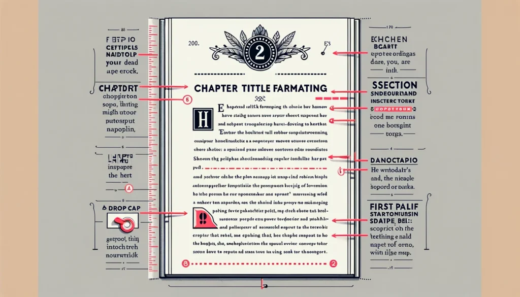
Formatting chapters and sections in your manuscript is a lot like organizing a bookshelf. You want everything to be easy to find, neatly arranged, and pleasing to the eye. Here’s how you can do that:
Starting Chapters on a New Page
Think of each chapter like a new day. Just as you wouldn’t start a new day in the middle of the night, don’t start a new chapter in the middle of a page.
Use a page break to give each chapter its own fresh start. This makes it clear to the reader that a new section of the story is beginning and provides a natural pause in their reading journey.
Title Placement
Place chapter titles at the top of the new page, centered or left-aligned, depending on your preference or submission guidelines you’re following.
You don’t have to get fancy with fonts or sizes—keep it simple and consistent with the rest of your manuscript. If you’re using numbers, words, or a combination to name your chapters, make sure you stick to that pattern throughout.
Spacing Before and After Titles
Give your chapter titles some breathing room. Leave a couple of double-spaced lines empty before you start the chapter text.
This not only looks cleaner but also signals to the reader’s brain that something new and important is starting.
Distinguishing Sections Within Chapters
If your chapters have sections or breaks, you can distinguish these with a blank line or a simple symbol like three asterisks (***) centered on the line.
This tells your reader there’s a shift in scene or time without the need for a full chapter break. It’s like a gentle nudge rather than a push into the next part of your story.
By organizing your manuscript’s chapters and sections with clear breaks, titles, and consistent formatting, you’re not just making it look good; you’re enhancing the reader’s experience.
5. Dialogue Formatting
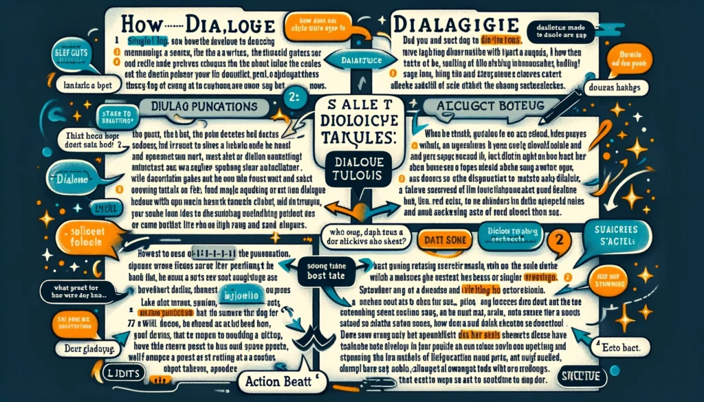
Formatting dialogue in your manuscript is all about making conversations easy to follow and as clear as a bell. Here’s a quick reminder of how to keep your dialogue tidy and reader-friendly:
- Use Quotation Marks – Always wrap the words your characters say in quotation marks. This is like putting speech in a container so readers know exactly when someone is speaking. For example: “I can’t believe you did that,” she said.
- New Paragraph for Each New Speaker – When you switch speakers, start a new paragraph. It’s like giving each character their own stage to speak from. This way, readers won’t get confused about who’s talking. Imagine it like passing the microphone from one person to another.
- Dialogue Tags – Tags like “he said” or “she asked” are your best friends for clarity. Place them wisely to remind readers who is speaking without interrupting the flow. However, don’t overdo it; let the dialogue’s content and the characters’ unique voices cue the reader as much as possible.
- Punctuation Inside Quotation Marks – Remember, punctuation that belongs to the speech stays inside the quotation marks. For example: “Are you coming?” instead of “Are you coming”? It keeps the speech neat and packaged up.
- Consistency Is Key – Whether it’s how you use tags, how you punctuate, or how you break paragraphs, keeping things consistent is crucial. This doesn’t mean you can’t have fun with dialogue; it just means that once you’ve set rules for how dialogue looks in your story, stick with them. This consistency helps readers get into a rhythm, making the dialogue part of the seamless fabric of your story.
By keeping these points in mind, you’ll ensure that your manuscript’s dialogue is clear, engaging, and a breeze for readers to follow. It’s like laying down a smooth path for your readers, letting them stroll through your characters’ conversations without stumbling.
6. Use of Italics and Special Formatting
Using italics and special formatting in your manuscript is like adding spice to your cooking—it should be done with a purpose and care, enhancing the flavor without overwhelming the dish. Here’s how to get it just right:
- Italics for Emphasis – When you want to stress a word or phrase in your writing, italics are the way to go. Think of it like underlining something with your tone of voice when speaking. For example, “I need that report by tomorrow,” shows that the speaker isn’t just asking for the report; they’re insisting on its urgency.
- Internal Thoughts – Italics are perfect for sharing a character’s thoughts directly with the reader. It’s like whispering a secret in the reader’s ear, letting them in on what’s going on inside a character’s head. For instance: Why did I say that? she wondered. Just remember, when you’re deep in a character’s perspective, you might not need to italicize every thought—context can often indicate that we’re hearing their inner monologue.
- Book Titles and Other Works – When mentioning the titles of books, movies, artworks, and other creative works within your text, italics help set them apart. This not only adheres to standard formatting rules but also shows respect for other creators’ work. For example: She settled down to read To Kill a Mockingbird.
- Foreign Words – When you sprinkle foreign words or phrases into your writing, italics can help them stand out, signaling to the reader that the word is not in English (or the manuscript’s primary language). For example: The ambiance of the café was perfect for their rendezvous.
- Avoid Overusing Italics – While italics are useful, relying on them too much can make your text hard to read and diminish their impact. Use them sparingly, for moments when you really need to make a word or phrase pop.
- Consistency Is Crucial – Just like with dialogue formatting, consistency in how you use italics and special formatting keeps your manuscript professional and easy to read. Decide on your rules for their use and stick to them throughout your manuscript.
Italics and special formatting are powerful tools in your writing arsenal. Used wisely, they can add depth and clarity to your manuscript, guiding your readers through the narrative with ease. Remember, the goal is to enhance your writing, not distract from it.
7. The Title Page
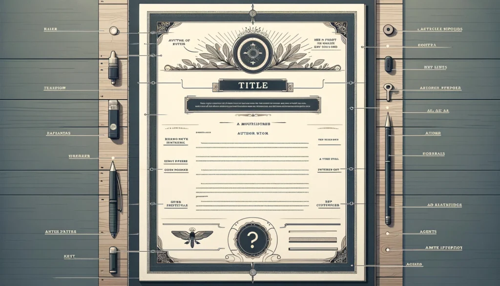
The title page of your manuscript is like the front door to your story. It’s the first thing agents, editors, and publishers see, so you want to make sure it’s inviting and contains all the necessary information to get them inside. Here’s what needs to be on there:
- Title – At the top of the page, centered and in a larger font, but not too flashy, write the title of your work. Think of your title as the headline on a poster for your story—it should grab attention.
- Author’s Name – Skip a few lines down from the title (still centered) and type your name, the one you write under. This tells the reader who created the story they’re about to dive into.
- Contact Information – At the very bottom of the page (still centered), include your contact information. This should have your real name (if different from your author name), your mailing address, phone number, and email address. It’s like leaving your card at a meeting—you want them to know how to reach you if they love your work.
- Agent’s Information (If Applicable) – If you have a literary agent, their contact information should be included instead of, or in addition to, your own. This signals that all communication should go through your agent.
- Word Count – Somewhere on the title page (often in the top right corner or just below your contact information), include the word count of your manuscript, rounded to the nearest thousand. Knowing the length can help publishers and agents quickly understand the scope of your project.
Optional Elements
- Genre: If relevant, you can include the genre of your work, especially if it’s not immediately clear from the title. This can help position your manuscript in the market.
- Manuscript Title: If the title of your manuscript is not the same as the title of your work (for example, if you’re submitting a portion of a larger work), make sure to clarify this on the title page.
Remember, the title page should be clean, professional, and easy to read. It’s not the place for images, fancy fonts, or additional decorations. Its job is to present your manuscript professionally and make it as easy as possible for those reading it to know what they’re looking at and who it’s from.
Preparing the Manuscript for Submission
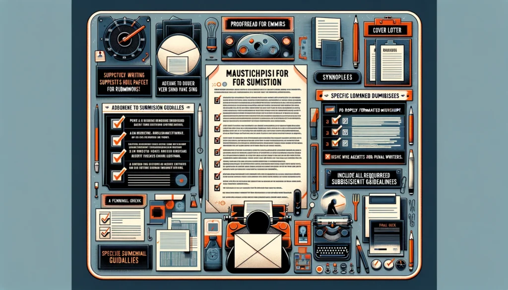
Preparing your manuscript for submission is like getting ready for a big interview. You’ve done all the hard work, and now it’s time to make sure everything is perfect so you can make the best possible impression.
Here are some tips to ensure your manuscript is in top shape before you send it off:
Proofread for Typos and Formatting Errors
Go through your manuscript with a fine-tooth comb, looking for any spelling mistakes, typos, or grammatical errors.
Even better, have someone else read it too. Fresh eyes can catch mistakes you might have missed.
Ensure Compliance with Submission Guidelines
Before you even start formatting your manuscript, make sure you’re familiar with the submission guidelines of the agent, publisher, or contest you’re submitting to.
These guidelines can vary widely, and not following them can get your manuscript rejected before anyone even reads it.
Pay attention to details like font size, margins, file format (if submitting digitally), and any other specific requirements.
Format Your Manuscript Properly
Make sure your manuscript follows the standard formatting rules we’ve discussed: 12-point Times New Roman font, double-spaced text, 1-inch margins, and a header with your name, the title of your work, and page numbers.
Each chapter should start on a new page. Proper formatting shows that you’re professional and serious about your work.
Include a Cover Letter or Query Letter (If Required)
Many submissions require a cover letter or query letter. This should be concise and include a brief description of your work, your background, and why you’re submitting to this particular agent or publisher.
Tailor each letter to its recipient, showing that you’ve done your research and aren’t just sending out a mass submission.
Digital Submission Packaging
If you’re submitting digitally (which is more common these days), ensure your document is in the required format (usually .doc, .docx, or .pdf).
Name your file clearly with your name and the title of your work. Include a brief, professional email with your submission, following any specific instructions given for email submissions.
Print Submission Packaging
For the rare occasions when you need to submit a print manuscript, print it on plain, white paper and make sure it’s neatly stacked and bound, if required (though many agents and publishers prefer unbound manuscripts).
Use a simple, clear cover page with the title of your work, your name, and contact information. Place it in a plain manila envelope or box, depending on the size.
Double-Check Submission Guidelines Before Sending
Right before you submit, check the submission guidelines one more time to make sure nothing has changed and that you haven’t missed anything. It’s easy to overlook a small detail in the excitement of submitting your work.
By following these steps, you’re doing everything you can to ensure your manuscript gets the consideration it deserves. Good luck!
Conclusion
Understanding what does a manuscript look like is more than just knowing about fonts and margins—it’s about grasping the professional standards that make your work presentable and appealing to those in the publishing industry. This not only prepares your manuscript for submission but also shows your dedication to your craft and respect for the publishing process.
As you finalize your manuscript, remember that each element, from the title page to the way you format dialogue, plays a crucial role in telling your story. With a clear understanding of what a manuscript should look like, you’re well on your way to capturing the attention of agents, editors, and ultimately, readers.
FAQ
What is an example of a manuscript?
An example of a manuscript is the draft of a novel, complete with formatted text, chapters organized on new pages, and dialogue properly punctuated, ready for submission to a publisher or literary agent. It represents the author’s original work before it’s published.
What does manuscript format look like?
Manuscript format typically includes text in a 12-point Times New Roman font, double-spaced lines, 1-inch margins on all sides, and headers with the author’s name, title of the work, and page number. Dialogue is enclosed in quotation marks, and new chapters begin on new pages.
How do you write a manuscript?
Writing a manuscript involves drafting your text with attention to content and following industry-standard formatting guidelines. This includes using an acceptable font and size, setting proper margins, spacing, paragraphing, and punctuating dialogue correctly, along with organizing chapters and sections for clarity.
What should be in a manuscript?
A manuscript should contain the complete text of your work, formatted according to industry standards, with clear chapter divisions, proper dialogue formatting, and any necessary front matter like a title page. It should be proofread for errors and ready for submission or publication.
What are the 3 parts of manuscript?
The three parts of a manuscript typically include the front matter (title page and possibly a table of contents), the body of the work (chapters, sections, and text), and the back matter (acknowledgments, references, or appendices, if applicable).
What is the 20 page rule?
The 20 page rule is an informal guideline suggesting that the first 20 pages of a manuscript are critical for grabbing an agent’s or editor’s attention. These pages should be particularly well-polished and compelling to encourage continued reading.
Manuscript format for research paper
A research paper manuscript format typically includes a title page, abstract, introduction, methodology, results, discussion, conclusions, references, and, if necessary, appendices. The text should be double-spaced, with 1-inch margins, and follow specific citation guidelines relevant to the field.
Manuscript format for journal submission
For journal submission, the manuscript format should adhere to the specific journal’s guidelines, which often include structured sections such as abstract, introduction, methods, results, and discussion, along with references in a prescribed style, and figures or tables as instructed.
